
Who’s hotter?
Comparing the urban heat island effect in three of my favourite cities.
Abstract
This article inspects the UHI effect in London, Tel Aviv, and Singapore. These three cities have different climatic conditions, urban fabrics, and populations. Using LST as a proxy for UHI, I map day and night LST in urban vs rural locations in the cities. Then I use NDVI to compare the quality of vegetation between the cities and show that increasing NDVI significantly decreases nighttime LST (LDN p=8.9e-115, TLV p=4.9e-07, SG p=1.6e-14). I then show that building height also has a positive correlation with nighttime LST in each city (LDN p=9.3e-73, TLV p=2.3e-191 , SG p=3.3e-112 ). Finally, I map a population weighted LST in each city to understand where high temperatures due to UHI actually impact the thermal comfort of city’s inhabitants. Then I visually and qualitatively compare daytime LST with maps of household incomes and residential property prices to add to the commentary in existing literature around lower income areas being less green and less thermally comfortable for residents.
Intro
My first experiment with google earth engine (GEE) was done on the Big Muddy to get familiarised with the workflow and the datasets available for free online. The aim of this piece is to continue exploring ‘geospatial analysis’, this time in a more sophisticated and less personal manner. I will inspect the urban heat island (UHI) effect in three cities: London, Tel Aviv, and Singapore (I did say less personal, not impersonal).
After briefly contextualising each climate using average temperature, universal thermal comfort index (UTCI) plots, and heat indices – which account for relative humidity (RH) in addition to air temperature to represent the ‘feels like’ temperature – I present maps of the land surface temperatures in both the day and night along with proxies for greenery and the form of the built environment.
The last section shifts away from purely climate related analysis to inspect the population densities and demographics of different areas, adding to existing commentary in literature that, unfortunately, the hottest and least green parts of our cities are densely populated and, unfortunately, there are often socio-economic implications as well.
Below is a short review of the UHI concept followed by a bit of background on the climate and vibe of each city.
Urban Heat Island
The desert is a great example of an environment which does not store heat. With no shade and the sun beating down on the sand all day, you wouldn’t imagine needing a sweater or a fire to sit around to warm yourself in the evening. However, due to the lack of cloud cover and moisture – which, by the way, is what enables the sun to heat the ground so intensely during the day – at night the heat rapidly radiates into space and deserts become cool.
This is an extreme example, but you can also think of the countryside, quaint villages and suburbs where, because of the lack of buildings and vertical thermal mass, as well higher wind speeds, they get colder in the night, even in summer. The difference in temperature between peak daytime and minimum nighttime within the same 24hr window is referred to as the diurnal swing, and can be up to 30 °C in deserts. A more typical difference outside of city centres would be around 10-15 °C.
Now, cities are made of cement, steel, brick, glass, and other industrial materials with a high thermal mass (the concrete jungle!) which absorb solar gains during the day and release them throughout the night. Tall buildings hamper local wind speeds and the cooling breezes which could help to carry the hotter air up and out of occupied levels – this is referred to as the canyon effect. Cities are triply impacted by having less vegetation, greenery being a heat and carbon sink and a source of evapotranspiration and fewer bodies of water which could enhance thermal comfort via evaporative cooling.
This is exactly what the urban heat island (UHI) effect is – when urban areas are significantly warmer than their rural counterparts either in the day, the night, or both. This difference is demonstrated later on by (potentially too) many graphs.
Background on the selected cities

Big bounding box for analysis of London, United Kingdom
London town
London's history begins around 43 AD with the Roman foundation of Londinium on the River Thames, becoming a major port and commercial center. Since then it has survived its fair share of plagues, fires, civil wars, aerial bombardment, terrorist attacks, and riots. It has birthed intellectual, cultural, and economic movements, and even before being the capital of a once massive empire, it has been a magnet for immigrants. Hence, London’s metropolis is sprawling; Greater London has amassed a population of 15 million over 1,572 km² while Central London itself has a population density of 11,000 people per km². From low-rise residential neighborhoods, council housing estates, Royal Parks, and listed historical buildings, to business centres packed with skyscrapers, the city houses many different typologies of buildings as well as people.
London’s climate is described as ‘marine west coast, warm summer’ with an average yearly temperature of 11.4 °C [low 0.3 °C, high 26.0 °C]. The UTCI graph and the heat index are included below to give a better understanding of perceived heat stresses throughout the year – in other words not just what the thermometer says, but what we would experience if we were outside (considering humidity, wind speeds, radiant temperatures included in the specific weather file, etc).

UTCI generated from a weather file from St James Park, in Central London, demonstrating the thermal stress you would experience outdoors in London throughout the year assuming it is sunny and windy. From CBE’s Clima Tool.

Heat index for London – given the climate is not very humid, the air temperature and the feels like temperature are overlaid.
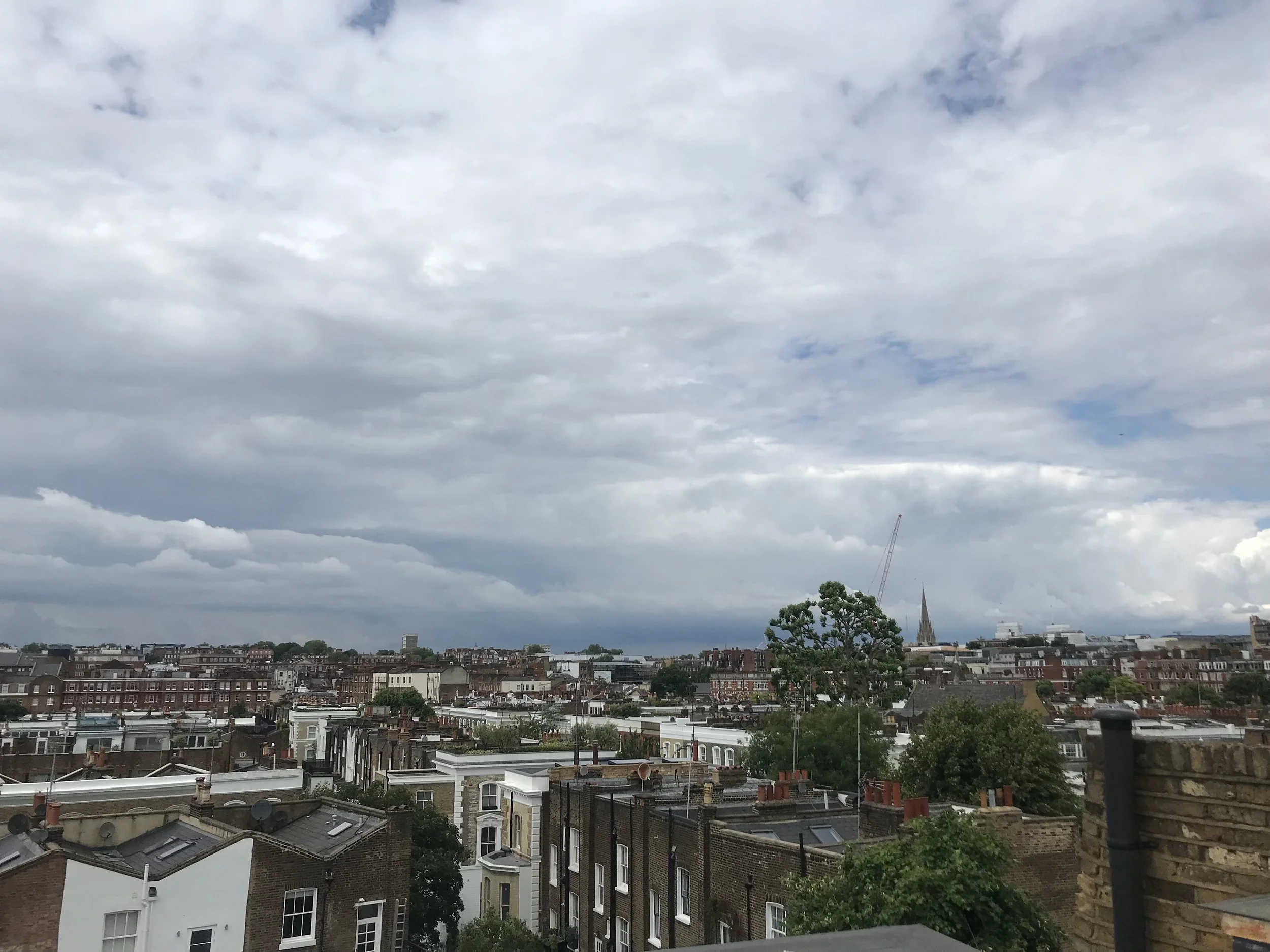
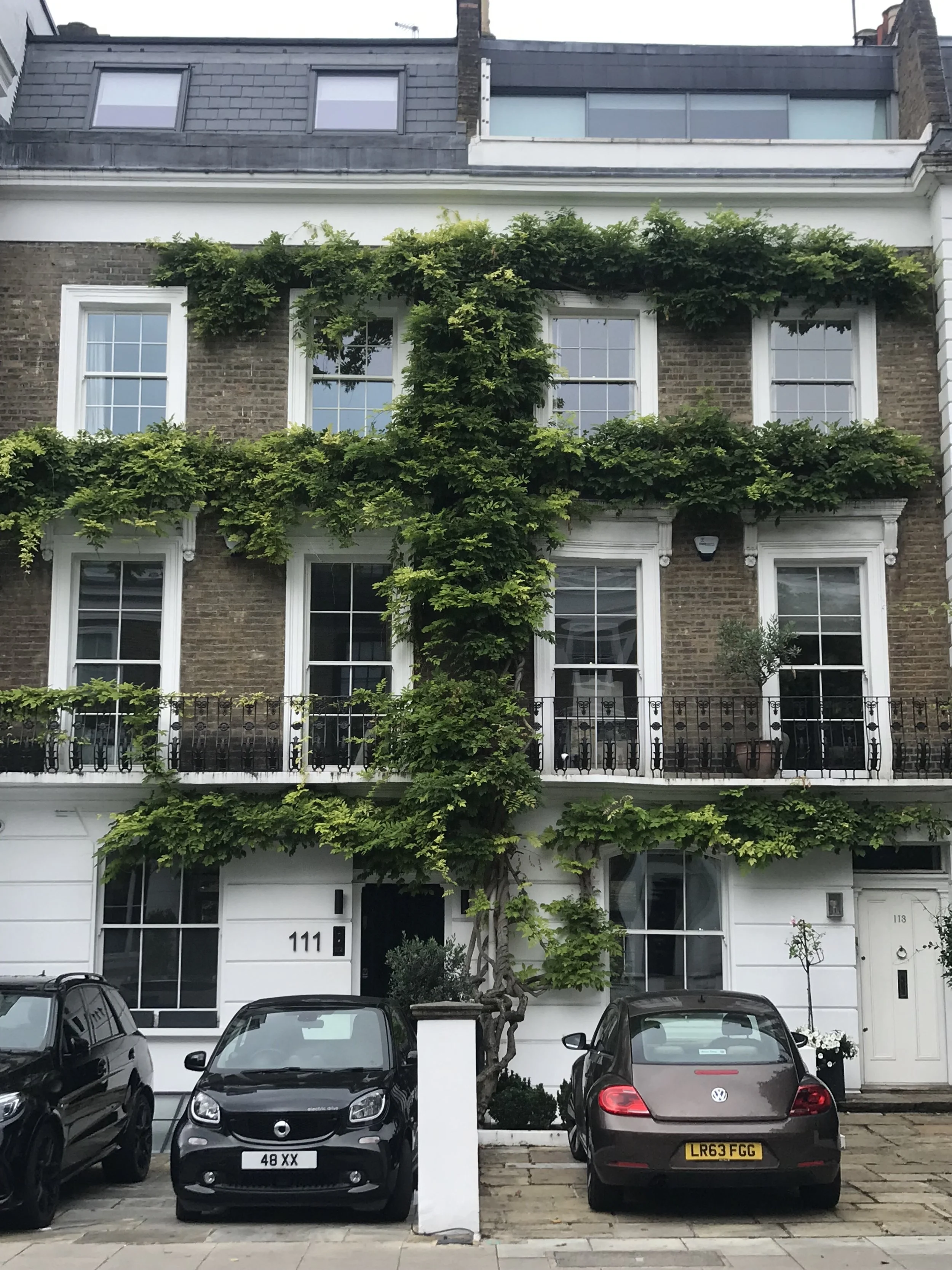
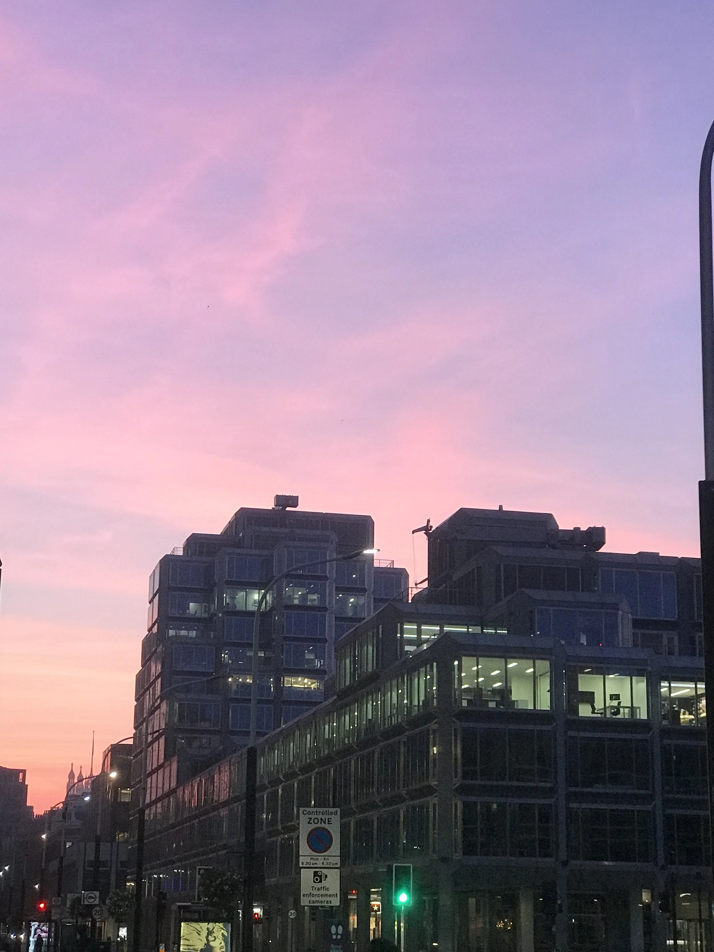
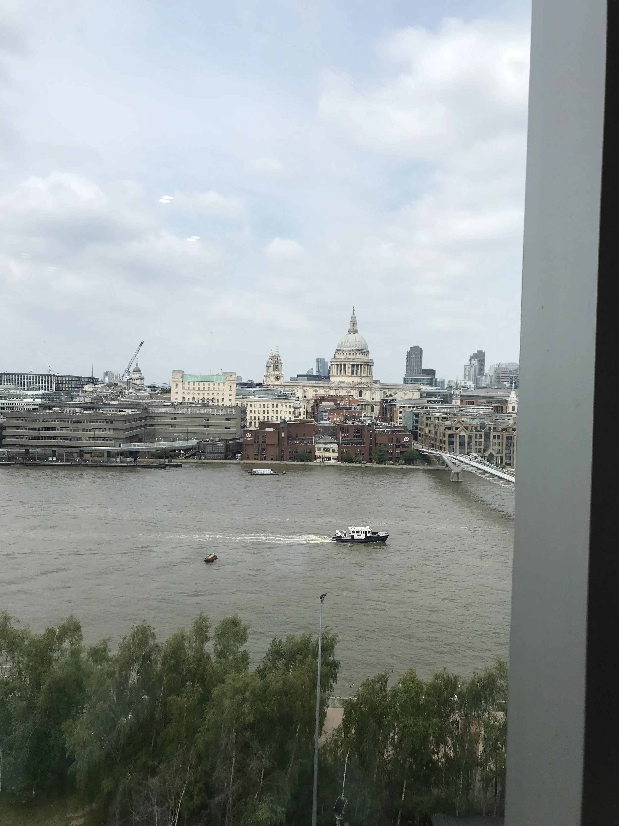
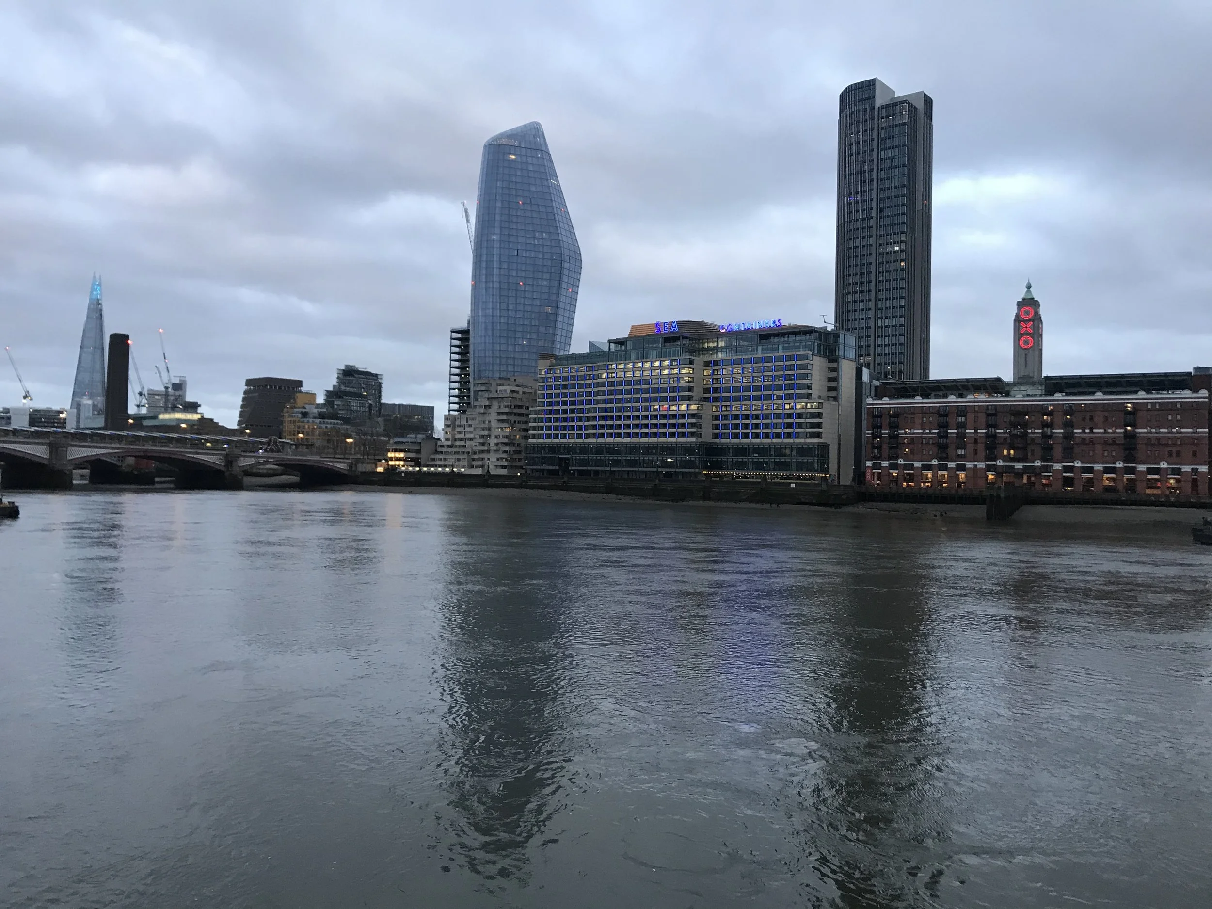
Finally, because I believe this whole exercise of analysing maps and graphs and numbers if you don’t have some sense of how the cities actually look like is pointless, see below photos taken in various parts of London over the past 6 years (all within the bounding box above!).


Bounding box for analysis of tiny Tel Aviv, Israel
Tel Aviv ya habibi Tel Aviv…
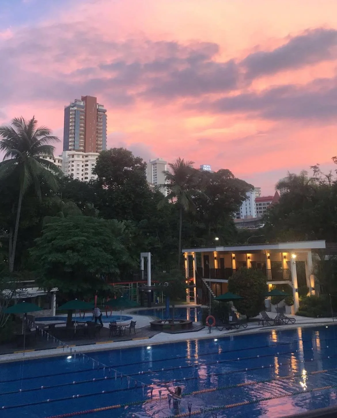
Tel Aviv is located on Israel’s Mediterranean coast. Tel Aviv Yafo’s (the Yafo suffix was added in 1950 to protect the name, of the historical port, Jaffa, just south of the city centre) current population estimate is 495,000, covering 51.4 km², with a density of 9,500 people per km². Despite its small size, it contains one of the largest economies – the largest per capita – in the Middle East. Unfortunately, depending on your sources, it also has somewhere between the 2nd and the 16th highest cost of living in the world as of last year. Tel Aviv’s White City, designated a UNESCO World Heritage Site in 2003, comprises the largest concentration of internationally fashioned buildings, including Bauhaus and other modernist architectural styles. More than that, the city is known to be the epicentre of the ‘start-up nation’, home to high tech start-ups – related mostly to serious innovation coming out of the military and agricultural R&D. It is also known to be the gay capital of the world. Tel Aviv’s climate is ‘Mediterranean with hot summers’. The average yearly temperature is 20.5 °C [low 10.0 °C, high 30.0 °C ]. UTCI and heat index plots as well as photos below.

UTCI generated from a weather file in coastal Tel Aviv, demonstrating the thermal stress you would experience outdoors throughout the year assuming it is sunny and windy. From CBE’s Clima Tool.

Tel Aviv’s heat index graphed with the air temperature, note the variation in the warmer parts of the year when the combination of heat and humidity push the perceived temperature higher than the actual air temperature.


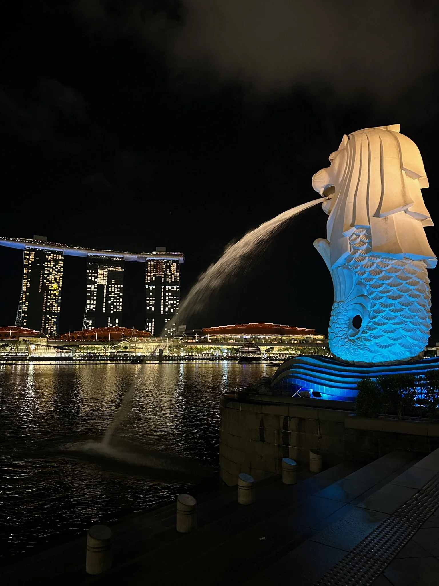
Bounding box for analysis of Singapore, Singapore
SG
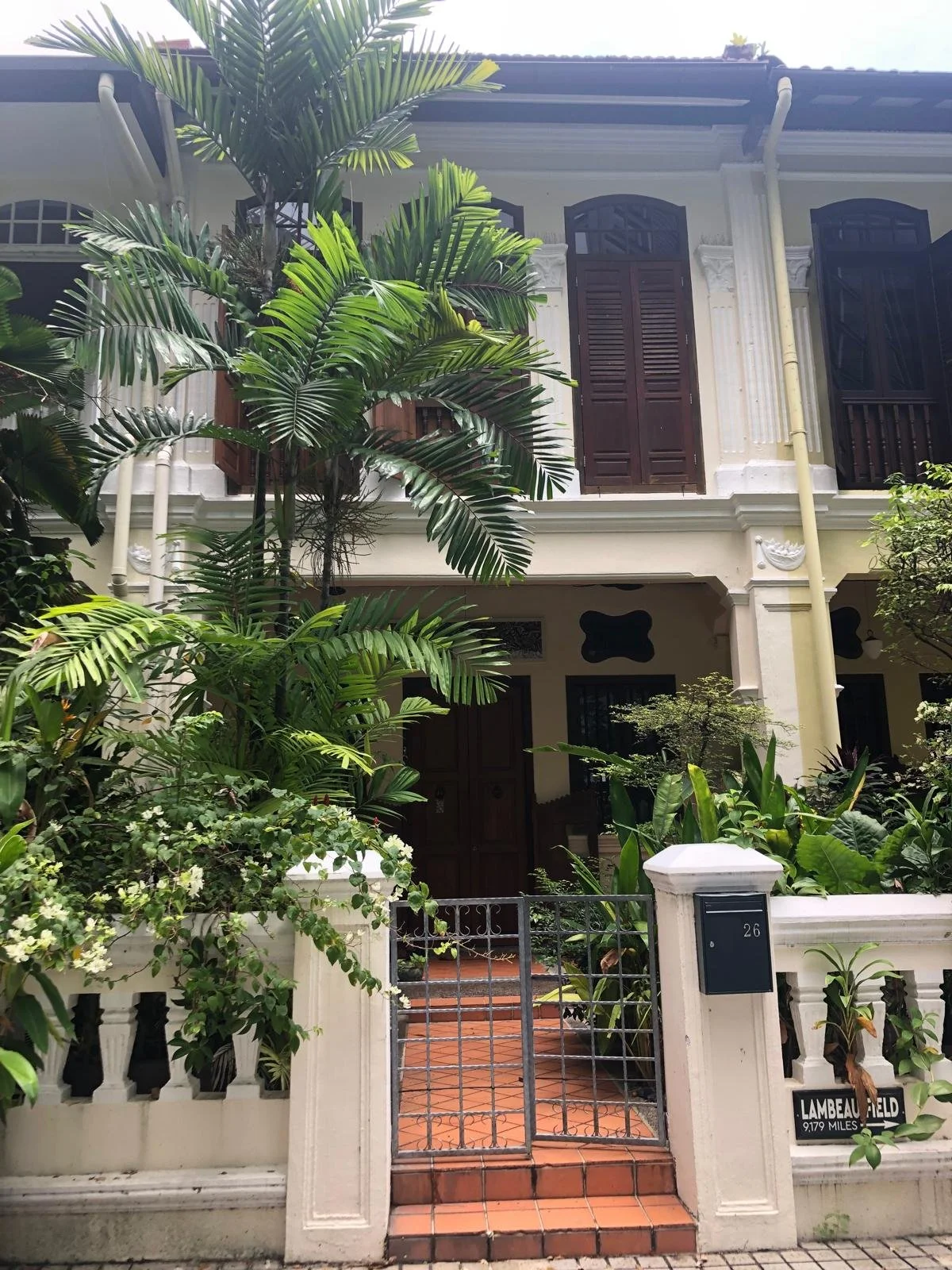
The recent history of Singapore connects, like many around the world, back to our first city, London. In 1819 Stamford Raffles led the British East India Company to this island and established a trading settlement. Many different people have travelled through, taken over, made it their home, left an architectural, linguistic, cultural, culinary, or some other sort of footprint before, during, and after the British rule. Officially the Republic of Singapore since 1965 upon separation from Malaysia, the little red dot has made incredibly quick progress in terms of development both tangible and intangible.
Singapore is famous for many things. For good food, strong Kopi, the Straits – through which 33% of the world’s traded goods pass – and more relevant to this work, for being the ‘City in a Garden’. Iconic projects such as Gardens by the Bay, Parkroyal on Pickering, Jewel Changi’s indoor tropical rainforest replete with a 40m waterfall, the Singapore Botanic Gardens (the world’s only tropical garden declared a Unesco World Heritage site), MacRitchie Reservoir, Henderson Waves, Mount Faber, the list goes on, with vegetation and greenery inundating the island every which way. Singapore’s climate is classified as ‘tropical rainforest’ with an average yearly temperature of 26.8 °C [low 22.5 °C, high 31.9 °C].

UTCI generated from a weather file in central Singapore, demonstrating the thermal stress you would experience outdoors throughout the year assuming it is sunny and windy. Note that the colour coded scale has adapted to the specific climate conditions. From CBE’s Clima Tool.

As expected for a hot tropical climate, the humidity levels in Singapore drive the feels like temperature consistently and significantly above the actual air temperature throughout the year.


Methodology
Now, moving into the technical content of this article. These were the steps taken for the analyses:
Define bounding boxes for cities of interest
Map the land surface temperatures during the day
Map the land surface temperatures at night
Map vegetation density
Map building height and information on building density where possible
Map wind speeds
Map the population weighted land surface temperatures to account for patterns of residence and uninhabited parts of cities
Find datasets on average household income and property prices throughout each city to compare with previously generated maps
Using a unique indicator for each city to inspect other socio-economic and demographic variables and see if there may be patterns relating to UHI
Land Surface Temperature vs Night Surface Temperature
Given the context above on UHI, the first mapping exercise was with the MODIS dataset which provides an average 8-day land surface temperature (LST). Each pixel value shown on the map is a simple average of all the corresponding pixels collected within that 8-day period. It is worth noting that the resolution isn’t much better than 1 km per pixel (average of all land coverage in that km²). Despite the resolution, LST is often used in UHI studies as it better represents the radiant heat of the built environment and surface area of cities as opposed to looking at wet or dry bulb temperatures alone; MODIS LST is often equated to skin temperature (not to be confused with our human skin) as it doesn’t measure air temperature directly, rather the thermal infrared radiance emitted from the land’s surface skin (roughly the top 0.1 mm of soil, pavement, roof, vegetation canopy, etc).
I arbitrarily chose July 15-23 of 2024 as the analysis period. After some sort of atmospheric correction which I won’t detail here, the aforementioned radiance is converted to the skin temperature at ground level. The daytime LST for each city is shown first, and then the night below.


There are a few things to observe. First, the resolution of this dataset is poorer during the day (top row). Although images are captured by the same satellite and in the same pixel size, the effective resolution depends on cloud cover and the viewing angle/orbital path. This explains why Singapore is especially patchy (top right). Singapore experiences significant cloud cover year round and is located near to the equator. The causes the noise and renders many pixels unusable.
Pixel smoothing pixels can be done by taking median data points or expanding the 8-day period when necessary, but the nighttime analysis itself is often is clearer because there are typically fewer clouds in the night sky. Note that although the colours are the same, the legends are autoscaled to the city’s specific minimum and maximum temperatures. Do note the dynamic scales when comparing the differences in temperature between day and night as direct comparison between the colours (red areas especially) could be misleading.
The second major observation is Tel Aviv’s clear inverse pattern in surface temperatures between night and day. The maximum nighttime LST is still lower than in the daytime, but the parts of the city that are the hottest are more central in the evening (where the urban density is), whereas the outskirts are hotter during the day (away from the sea). This is UHI in full effect.
London and Singapore both show the same patterns, where the urban centres are warmer at night than surroundings.
Moving away from the geographical visualisation of the surface temperatures on the maps, there are two sets of line graphs below. The top three plot the difference between LST measured in an urban and a rural point within the same city. This demonstrates again that urban centres are generally warmer than their rural counterparts.
Tel Aviv sees a negative difference during some portions of the year for daytime LST, meaning the urban spaces are slightly cooler than rural. This was suggested in our maps above, and is likely because the soil and the land outside of Tel Aviv soaks up the strong and direct Mediterranean sun quickly during the day (but then releases it quickly at night). As the graphs in the second row show the difference in urban and rural LST at night, it suggests Tel Aviv experiences its UHI at night.
In London we see slightly more similarities with the day and night, likely because there is less rural area within our boundary analysis, but London also experiences significant UHI at night. Singapore, although tropical and humid, has a vegetation strategy that makes it able to cool the city centre quite effectively in the day while temperature differences are more distinct (even if lower) at night.


Normalised difference vegetation index
Next we start look at the variables that may impact UHI, as opposed to the surface temperatures in isolation. Normalised difference vegetation index (NDVI) is a way of measuring the vegetation of a surface and is widely used in remote sensing work. It is calculated using the equation below, cleverly manipulating the way that greenery interacts with the light spectrum to classify plants:
NDVI = (NIR−RED) / (NIR+RED)
where NIR: near-infrared radiation and RED: wavelengths of red light
Because green plants absorb red light for photosynthesis and reflect near-infrared radiation to avoid overheating, NVDI leverages that contrast and the ratio to create the following scale [-1,1]:
<0.00 - 0.00 = water / snow / clouds
~0.00–0.10 = bare soil / rock
~0.10–0.30 = sparse grass / shrubs
~0.30–0.50 = moderate vegetation
~0.50–0.80+ = dense vegetation / healthy canopy


The findings from this exercise align with the narrative that dense vegetation has cooling benefits. London is the best example of this, with LST plotted against NDVI below, or, heat against amount of healthy and dense vegetation, showing that plants really do combat UHI.
Tel Aviv is different, in fact, vegetation does not have a statistically significant effect on daytime LST. This is probably due to two main reasons. First, as mentioned earlier when inspecting the graphs showing the difference between urban and rural surface temperatures, because of the semi-arid Mediterranean climate the rural pixels are often bare soil, which heats up more than urban concrete in the day, breaking the vegetation signal. Second, Tel Aviv has our smallest bounding area and therefore represented by the smallest number of pixels (being a smaller city itself, right against the sea). Because MODIS has a resolution of 1km and sometimes blends pixels, using NDVI is not a good indicator of UHI in this particular case.
Finally, Singapore also has a clear and statistically significant vegetation-cooling signal although it is a smaller sample size and less defined than London. Despite cloud cover and a tropical climate with higher background temperatures year-round, the relationship between UHI and vegetation is still strong. Each city has a higher range of variance which can be explained conceptually by the fact that the UHI effect is multicasual; you cannot correlate it with one variable alone. I have left a summary table in markdown of the linear regression results below.


| index | city | slope (°C per +0.1 NDVI) | r | R² | p-value | n_pixels |
|---|---|---|---|---|---|---|
| 0 | London | -0.760 | -0.52 | 0.27 | 6.49e-274 | 3930 |
| 1 | Singapore | -0.77 | -0.47 | 0.22 | 7.70e-39 | 653 |
| 2 | Tel_Aviv | 0.13 | 0.05 | 0.003 | 0.34 | 277 |
Now, we have seen several times so far that not only local climate, the design of built environment, and how much vegetation a city has all impact UHI, but also the simple difference between day and night. I reran the same regression, this time time night LST versus NDVI. The question here is, does vegetation have the same effect on cities in the day as in the night?


With the day LST vs NDVI we saw that surfaces heat up quickly in the sun and – apart from Tel Aviv – dense, healthy, vegetation could help them keep cool. At night, there is still a significant relationship between vegetation and surface temperatures, but the slightly weaker effect has a different explanation. Instead of providing shade and some cooling via evapotranspiration as they do during the day, at night the vegetation simply loses heat faster than urban surfaces (less thermal mass). Vegetation also finally shows a meaningful cooling relationship with LST for Tel Aviv at night, though it didn’t during the day. This follows the above logic that soil radiates its heat upwards quickly at night – similar to the desert explanation from the introduction – while Tel Aviv’s built-up urban surfaces retain their heat, so the contrast finally appears.
city slope (°C per +0.1 NDVI) r R² p-value n_pixels
London -0.283281 -0.356157 0.126848 8.948943e-115 3825
Singapore -0.211171 -0.317272 0.100662 1.628153e-14 558
Tel_Aviv -0.356574 -0.308159 0.094962 4.921819e-07 256
Building density, building height, and the wind
Unsurprisingly, buildings find a place in this discussion! For this section of analysis, I first looked at the GHSL built-up surface area 2018 dataset at 10m resolution to visualise the concentrations of built-up surface area in each city (i.e., where is most of the concrete?). Each 10m×10m cell contains the estimated built-up surface area in square meters. The white cells with a value of 0 have no urban buildings within them, whereas a black cell with a value of 100 means that 100% of that cell’s surface area is covered by buildings. These maps are shown below. In London this highlights the City of London and Canary Wharf area as well as Liverpool Street. Tel Aviv is a bit more evenly distributed, but similarly with Singapore there are larger gaps that lack any build-up; likely parks or untouched suburbs.


Next I looked at the GHSL P2023A Built Height (2018) dataset to inspect not only building density but building height. This datasets has a 100m grid resolution. Note that this does not capture the height per building and takes the average of all heights in that 100m cell. It also doesn’t account for buildings constructed from 2018-present. Still, it’s good data for the city-wide analysis I have been doing so far. The images below show building heights mapped within the bounding boxes of each city. I plotted the building heights against night LST. I chose the night because we have seen this is significant for all cities, and in general UHI can be clearly detected in dense concrete cities after dark. Cloud coverage and evapotranspiration from vegetation are implicated in the daytime, and for building height specifically – overshadowing and shading and the reflectivity of the material itself (albedo) can impact the signal. The plots for each city below show the following regressed correlations:
London: slope=0.080 °C per meter, r=0.27, R²=0.08, p=9.29e-73, n=4162
Tel_Aviv: slope=0.048 °C per meter, r=0.47, R²=0.22, p=2.34e-191, n=3512
Singapore: slope=0.069 °C per meter, r=0.50, R²=0.25, p=3.3e-112, n=1742


The next three plots also show the link between building height and LST. The x-axis represents the building heights as deciles (split in ten equal groups by height, the median height of each pixel in our analysis is marked on the axis). The y-axis plots the corresponding night surface temperature of that pixel. Again, London has the largest sample size and most diversity in building height out of our cities but certainly on the lower-mid rise side when compared with Tel Aviv and Singapore (again, note that the axes are autoscaled to the cities respective values). London shows a moderate but consistent correlation. In Tel Aviv it seems that night LST increases with building heights up until about 15m and then there’s a plateau. Singapore has the strongest slope of all three cities, although there is a slight decline after ~20m, due to either noise in the sample or resolution, or potentially proximity to bodies of water or nature.


Finally, I looked at using the ERA5-Land dataset from GEE to map wind speeds. I wanted to discuss the benefits of breeze in terms of thermal comfort as well as mitigating UHI, potentially demonstrating how tall buildings can negatively impact the effectiveness of wind in a city environment. However, the dataset I found has a resolution of about 9km (a downgrade from those used before) and it captures the free-air wind over that 9km pixel at a 10m height. Unfortunately, this renders any discussion of the flows around city streets at occupied levels impossible. It would not capture the sheltering effect of buildings or any wind tunnels or accelerations. For this a more micro-scale CFD would be needed. Regardless, the maps are below. They were generated and can still give a big-picture view of the wind speeds in the respective cities, however, I included wind roses from CBE’s Clima Tool as even though they don’t map the distribution of the wind speeds on a map, they reveal other useful bits of the story. Even though I studied engineering and work at as an environmental designer I still needed to use this article the first time I looked at a windrose (just in case).


We the people
If you have even made it to this point of the article, first, thank you. Now we will leave behind the miscellaneous climate and UHI related tests as we have reached the point where we can confidently accept (not that we couldn’t before…) that
a. the UHI effect is real, whether in the night or day depends on the local context and
b. vegetation can help mitigate UHI and
c. urban areas with a high density of tall buildings generally make UHI worse.
With those conclusions we will look from a few different angles at how this UHI effect could impact us, the inhabitants of cities, beyond of course, just experiencing more heat stress in some areas. Now, given that I am not yet an academic, I have purposefully not approached this article with any bonafide research questions. The purpose is to be exploratory, loosely structured, and build inquisitive skills using GEE datasets. That being said, I expect the following pattern:
The areas with higher LST (which are populated of course) may have lower house prices and lower average household incomes. There are so many interesting variables to investigate, but this piece has already become unacceptably long so we I looked to stick with three key indicators summarised in the table below.

Three key indicators to investigate for potential correlations with LST as a proxy for UHI.
The population weighted LST is computed by multiplying the population per pixel by the surface temperature in the pixel and dividing by the total population. So, each pixel in the maps below show the average (night) LST that people within about 1 km (grid resolution) are exposed to. As the graphic above highlights, the dense neighborhoods dominate the local value while unpopulated areas are masked out by the weighted calc, making this an acceptable representation of what the city inhabitants experience. The spaces that are red here indicate an area to compare against and focus on when inspecting variables such as household income and property prices. These maps are interesting because they don’t plot where there is no population data – and while this isn’t clear in the London map because the only depopulated area is the Thames and water has been exempt from LST mapping throughout all these exercises – in Tel Aviv it is apparent in the south east corner and Singapore illustrates it best. Changi airport to the east and a military airport and unpopulated industrial area to the north west is blank on our map.


London
For London I was able to embed a map below from the Office of national statistics. Looking at net annual incomes in the same boundary box that we used above to plot population weighted LST, we can make some qualitative observations.
Given the complexity of data wrangling, I did not overlay the two or run analyses to show the statistical significance of the relationship. However visually you can detect a pattern below, comparing net annual income from the interactive map above with the daytime LST in areas of Greater London.

The same pattern is visible when we repeat the exercise, but this time with a map of residential housing prices I found on plumplot.

TLV
Looking next at Tel Aviv, reporting discrepancies made it difficult to find granular data on incomes per region of Tel Aviv itself, which is already a small city. Instead, below I present quite a few interesting and related findings that can be taken together to weave a narrative along the same lines that I have developed throughout this piece.
Research has already established that population exposure to heat stress in Israel is severe and increasing at the fastest pace among OECD countries. There are studies inspecting spatial planning strategies as well as the use of nature-based solutions such as increased surface greenery, vegetation, green roofs, and vegetated vertical surfaces (to increase the NDVI of urban centres). Many pieces that put forward policy proposals in and out of Israel suggest that greening be prioritised in low-income areas where households are less able to afford cooling.
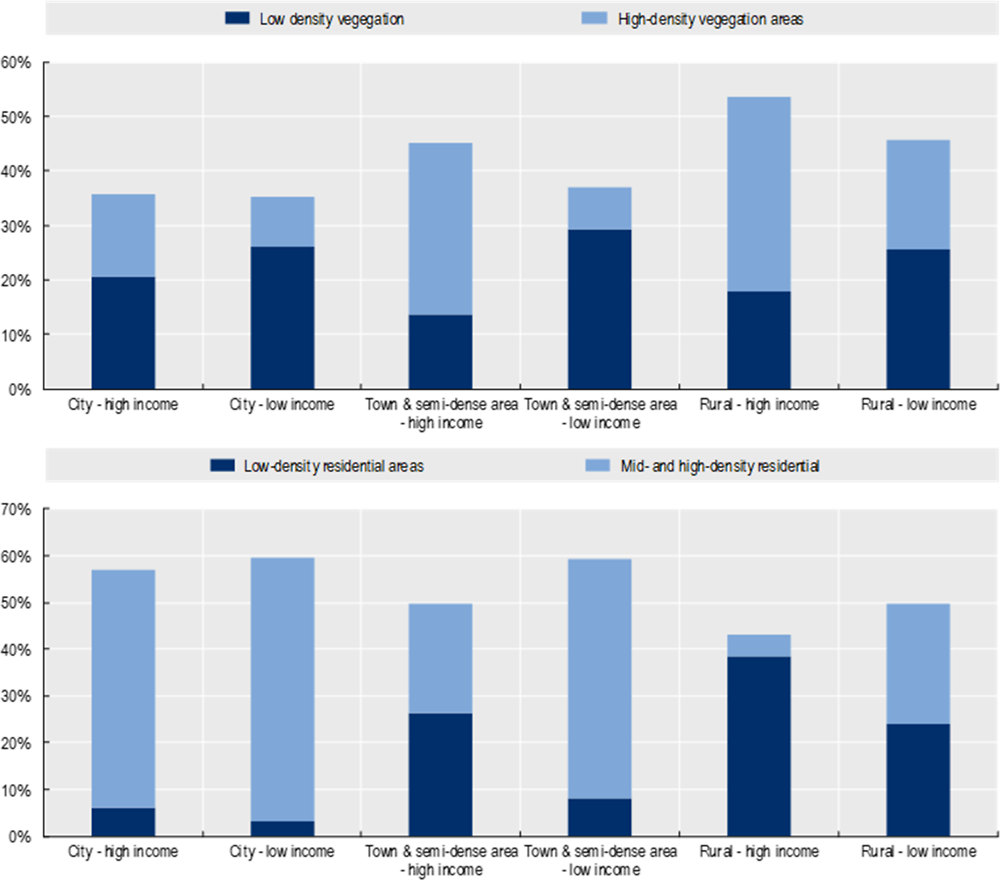
Graphs illustrating my point courtesy of the OECD.
In Israel specifically, studies show the share of low-density vegetation is much higher in low-income neighbourhoods while the overall amount of vegetated areas are similar. This adds to the overarching narrative in this piece that vegetation can be helpful, but is even more helpful when it is dense and healthy. For example, a green lawn may cover a lot of surface area in a neighbourhood, but it won’t provide as much cooling and health and well-being benefits as a smaller but denser and more lush garden with varied vegetation. This is built in to the NDVI, but is unfortunately sometimes neglected as a consideration in planning and design of spaces. The good part of this fact is that increasing density inherently minimises the need to alter land use (something governments, developers, and property owners would be wary of as every square meter dedicated to greening is one lost from profitable, lettable area).
I have my opinions about the rest of the research presented by the OECD, as they go on to segregate income levels by population based simply on ‘Jewish’ versus ‘Arab-Israeli’ which is an incredibly massive oversimplification of the demographics in the country.
This being said, research and discussion of that is for another piece entirely. Instead I managed to find a map from gov.il showing median annual income. Again, given the complexity of finding, cleaning, and analysing data these inspections are all visual and suggestive. Although there do seem to be some patterns along the lines we might expect, it’s difficult to be certain given the noise of the sea, non-residential areas, and scale differences as well as a language barrier that creates a lack of clarity around exact measurements and definitions.

Singapore
Singapore Real Estate Exchange has an incredible property value heat map that tracks updates to their data visualisations down to the minute. Three maps are shown below as Singapore’s housing market can be divided in three:
HDBs (housing development board) which is Singapore’s form of public that is only available for purchase in 99 year leases upon meeting certain criteria. Subsidies and grants are available from the government
Condos which are quite self explanatory apartment blocks
Landed properties which are the most sought after and indlugent, full houses with private gardens
The maps below show a similar pattern, however I must reiterate that LST and property values are both multicausal. For example, some areas in Singapore are less urban and therefore less warm, but perhaps have lower values because they are also less connected, closer to the border with Malaysia in the north for example.

Value of landed properties in Singapore by region and price per square foot (SGD)

Value of HDB (public housing) properties in Singapore by region and price per square foot (SGD)

Value of Condo properties in Singapore by region and price per square foot (SGD)
I was unable to find a map of Singapore incomes by district, however asia one and seedly had both published some charts following a national census. I have highlighted districts below in purple with the highest proportion of top household income. Conveniently, there are all areas that are green on our LST map.

Conclusion
This was a long, rambling, and fun exercise exploring GEE datasets further, particularly using surface temperatures, vegetation indices, and various incendiary proxy variables to explore the UHI effect in three different cities in three different climates around the world. Although this piece was far from academic and does not contribute any revolutionary new findings to the literature, we were able to show that dense vegetation helps cool urban centres, that the UHI effect is more pronounced in city centres than in rural areas at night and during the day (apart from in Tel Aviv where the surrounding landscape heats up more than the urban centres in the daytime), that building height does worsen UHI, and that there are likely correlations between localised climates in a city and the density of the population, the value of property, and the income of the households living there.
Limitations
Pixel resolution, my coding abilities, and data sourcing are the biggest limitations in this exploratory piece of work. As discussed above, the resolution of some of the GEE datasets is quite coarse. My bounding boxes in each city (particularly Tel Aviv) could have been enlarged in order to enable further contrast and comparison with more rural areas. My coding abilities and the casual approach to this article mean that all graphs, charts, and conclusions, as well as statistical analyses are quite elementary and rough around the edges. In the final sections of this piece where attention was turned to datasets outside GEE, it was difficult and time consuming to source and clean data and overlay it onto the geometry of my city maps. This leads to limitations in the conclusions that can be made in the final section, as they are on a solely visual basis.
Future work
Beyond the obvious, which is to invest more time data wrangling to test the significance of socio-economic indicators against LST, NDVI, and other climate variables, it would also be interesting to investigate other cities with unique climate and/or urban planning systems to look for patterns and anomalies. I think there are many more datasets to explore within GEE itself, so further refining mapping and geospatial analyses within the same environment could be another great direction.
One obvious next step for this work would be to approach it from a more academic and rigorous point of view with a focused research question to hand.
That being said, I also would enjoy taking a creative license and searching for data on the following to see if it looks to correlate at all with LST [potentially very interesting alternatives in square brackets] :
London; density of Gail’s coffee franchises [pubs, listed buildings]
Tel Aviv; % of residents working in high tech [served in intelligence units in the IDF, dual passport holders]
Singapore; density of expats [number of years residing in the country, type of visa held]
Further reading
OECD report on redefining spatial planning and development in Israel
All the benefits of Urban Green Spaces in a case study from Spain
Critiques of Israeli planning policy
Demographics of Israelis working in high tech
Urban poverty in Singapore