
How pleasant would it be, to take a walk here with thee?
We can walk.
I subscribe to the extreme cliché that the best way to experience – and even better to learn – a city is by walking it. This extends beyond an enriched touristic experience and into the everyday life of a resident. It’s almost always healthier for yourself, and for the planet, to walk. When walking is impractical the second best is to cycle, then public transport, followed by the car. Of course, there are limitations in this hierarchy of mobility. I am generalising away places with low air quality, extreme temperatures, and overlooking individuals that may have physical disabilities or chronic illnesses. I am also assuming that the urban fabric is safe and comfortable to traverse on foot. These factors, and others, impact the ability and the choice to walk.
In this piece I inspect the walkability of three cities. I first use an existing tool and compare the results with my lived experience – supplemented with qualitative input (casual conversations) with residents. Then I present data on the cities which existing walkability indices don’t necessarily consider, proposing adjustments in line with literature on the importance of microclimate and thermal comfort in terms of pedestrian experience [solar rad, overheating indicator, walkability scores, Walk EU]. I highlight the same variables that are shown to have an impact on outdoor thermal comfort such as street widths and building heights, orientation, and vegetation [Parametric sim, Urban canyons, aspect ratio and orientation]. Combining climate and built environment data with my own experiences, I aim underscore there are many answers to the question: ‘What makes a city walkable?’ beyond some of the metrics that we can quantify: densities, proximities, outdoor thermal comfort, air quality, traffic, safety, and urban form more broadly. This encourages holistic thinking when it comes to cities and their design [GDCI].
Before detailing the cities selected for this paper I present a brief conceptual discussion on variables that impact walkability.
What variables impact the walk?
Size
There are many ways to quantify the ‘size’ of a city [IMF, That Is Interesting]. I use population and land coverage which distill to population density. This is one way to capture the extent of urban sprawl, or how much a city grows out versus up. It is widely accepted that denser cities are more navigable and walkable, and can be more equitable – combatting issues that accompany sprawl with communities living isolated on the outskirts, further from all that an urban centre has to offer [ArcGIS, Nature]. Dense cities are theoretically more walkable, with less distance to cover on foot to get where you need to be. Of the three cities selected, I attempted to find comparable densities to control for one of the many complications present in these types of studies.
Climate
To state the obvious, some places in the world experience more comfortable temperatures than others. In this study I purposefully exclude any cities in the arctic, or any desert oases. I include this discussion on climate not to overcomplicate, but simply to acknowledge yet another variable that informs and embeds itself in culture and our decision making [Blog, Euro think tank]. If you live in a place with a temperate climate year-round, a view of the sea, breeze, and constant sunshine, you are probably more likely to walk everywhere even if it takes you longer to reach one amenity or another than someone in a cold place that gets dark everyday by 17:00 [MDPI, Buro Happold]. If walking, and even cycling, is thus embedded in your culture you’re likely to bring it with you to another city as well. The cities in this piece are all located in the northern hemisphere, so I inspect two extreme days - one in the winter and one in peak summer - to make commentary around the thermal comfort of pedestrians [Transform transport, Wind chill in winter, Outdoor comfort, Building and Environment, Solar shading Milano, Buildings & Cities]. Beyond characterising the climate in each city with average, maximum, and minimum temperatures I also look at the universal thermal comfort index (UTCI) which captures the ‘feels like’, or perceived temperature, relative humidity, and annual rain levels.
Car culture
There are countless differences between cities in America versus Europe, The Gulf versus ‘Middle Eastern’ countries along the Mediterranean or North Africa, or in Chinese megacities versus smaller cities throughout Southeast Asia. In this piece I look to compare things like street widths, kerb heights, speed limits for traffic, frequency of congestion charges or car free zones/times throughout municipalities, even satellite images, and you can notice almost immediately who designed their city for people and who designed for cars [Cities, Doughnot Economics Lab]. Unfortunately, when cities are designed to accommodate multi-lane streets, they usually aren’t as compact and pleasant to walk. Measures can be put in place, and are often mandated, to ensure safety and ameliorate the experience of coexisting with cars. There are minimum distances that should exist between the road and pedestrian paths and buffers such as kerbs, rails, and trees and dense greenery are encouraged [WELL, OBF]. I attempt to identify ‘busy’ or ‘heavily trafficked’ streets using data on speed limits or street widths. Then I attempt to identify the aforementioned types of buffers. This is an important part of the discussion as, of course, you could be very close to ten different amenities in a city, calculated as less than a five minute walk, however, if that walk is along a narrow footpath adjacent to a street with cars travelling 40 km/hr it will not be a pleasant or healthy experience. Simply inspecting distances and time to nearby destinations may tell one story, while a more holistic assessment tells another. Finally, I attach discussion on air quality to car culture. Air quality stands alone as a variable, depending on many things apart from cars, but arguably, the more density of cars, the worse the air quality (even if they become all electric one day there are still microplastics shedding off the tires, potentially more severely from a Tesla than a Fiat 500 given the weight difference [The Tyre Collective, Canary Media, Forbes]). In case it reveals anything interesting, I have included statistics on air quality.
People culture
This bit of the conceptual discussion becomes kind of like the chicken and the egg. There are some cultures around the world known for their fondness of walking, for example, the Italian passeggiata or Baudelaire’s flâneur [Italian diaries, Walk]. While Italians walk their streets more, their streets tend to be more pedestrian centric by design so you could argue that the climate and design of Italian cities has been conducive to walks, hence, Italians developed a love for taking on their neighbourhoods à piedi. Either way, this shows that inhabitants in some places appreciate the act of walking more than others [Springer, UWL]. Given that walking is healthy for people and planet and is something to encourage [US study], I will address culture in this piece based on my research and experience and try to determine how much is the people and how much is the place. As our personal backgrounds shape how we respond to our environments - including our walking patterns - it’s also interesting to consider the difference between walking as a means of commute and socialisation (what this paper focuses on) and walking as a means of exercise. For example, many Americans are avid hikers and are quite fit and healthy, however, they drive their cars around everywhere in their cities. In that instance walking becomes an activity in isolation. The danger there, in my opinion, is that you tend to lead a more consistently sedentary lifestyle with short bursts here and there [British vogue, Blue zones, Norway study]. Either way, mostly tangential to this piece, so we continue.
Time
Again, the purpose of this section was not to encourage concision but to expand on many different variables for a pre-study discussion. The variable time could be captured within climate as well as people culture. I see time relating to walkability in a few ways. Most simply as I mentioned before, from a local climate lens. Temperatures, and to a lesser extent sunlight hours (there’s nothing wrong with people walking around at night), impact the amount of time people are encouraged to spend outdoors. For example, Mediterranean climates experience a greater proportion of time throughout the year in comfort as opposed to a place like Singapore or Saudi Arabia where, for different climatic reasons, there is a higher percentage of hours throughout the year ‘out of comfort’ when it’s not pleasant to walk outside without significant shading and cooling measures in place. Time also relates to the demographics of a city. Are ages skewed in one direction or another? For example, are there many retirees who have regained control of their time, where pressures of work, child care, and similar responsibilities necessitate fast and efficient commutes from A to B without delay (no time for walking)? Are there loads of tourists in the city year round who roam on foot? Are there families who value outdoor and community areas for children and pets? Is there a working population who spends 12 hours a day at their desk? These all impact how much time inhabitants have to walk, as well as the culture that is fostered and the design of the city [COVID-19 study].
Safety
This last variable is so obvious I almost forgot to include in the discussion. Safety in relation to walkability is related to car culture in the sense that pedestrian infrastructure must not only be pleasing and comfortable, but safe. However, the essence of safety is crucial to consider. Places high in crime rates will inherently discourage walking; I include a proxy for crime in the case studies. Safety from violence or crime likely captures the cleanliness of streets and cities to some extent, but that is also for another paper. Arguably discussion on greenery and pedestrian elements is superseded by the basic need for clean streets free of litter and deterring scents [Dutch study]. The photographs I have taken hopefully capture all of the above and in conjunction with data on crime rates can enable commentary.
The cities I chose
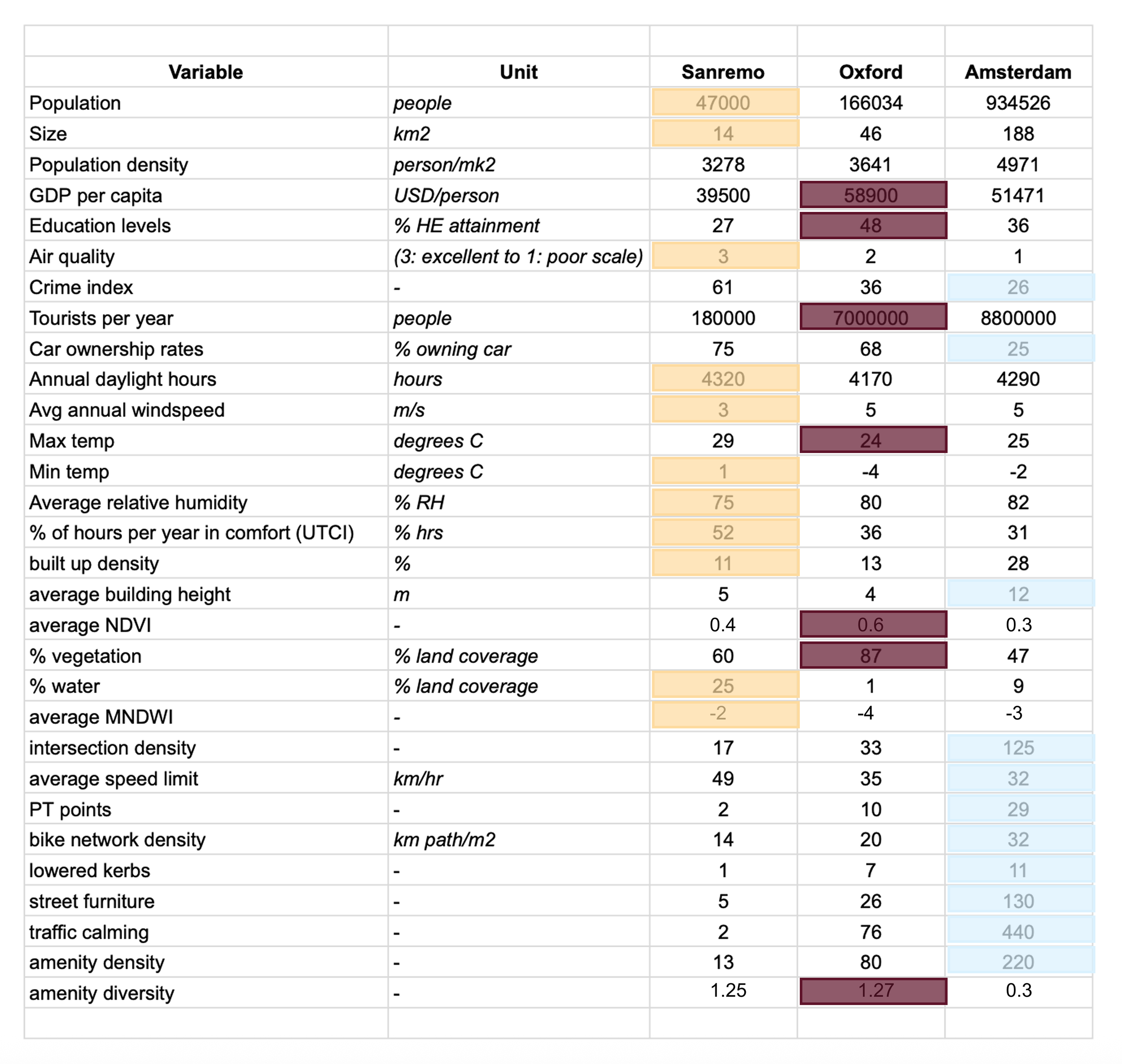
Due to a combination of good memories but also data availability and attempts to create semi-fair comparison, I selected Sanremo, Italy; Oxford, UK; and Amsterdam, Netherlands for this study. I characterise them in the table below and provide photos in case you haven’t yet visited yourself.
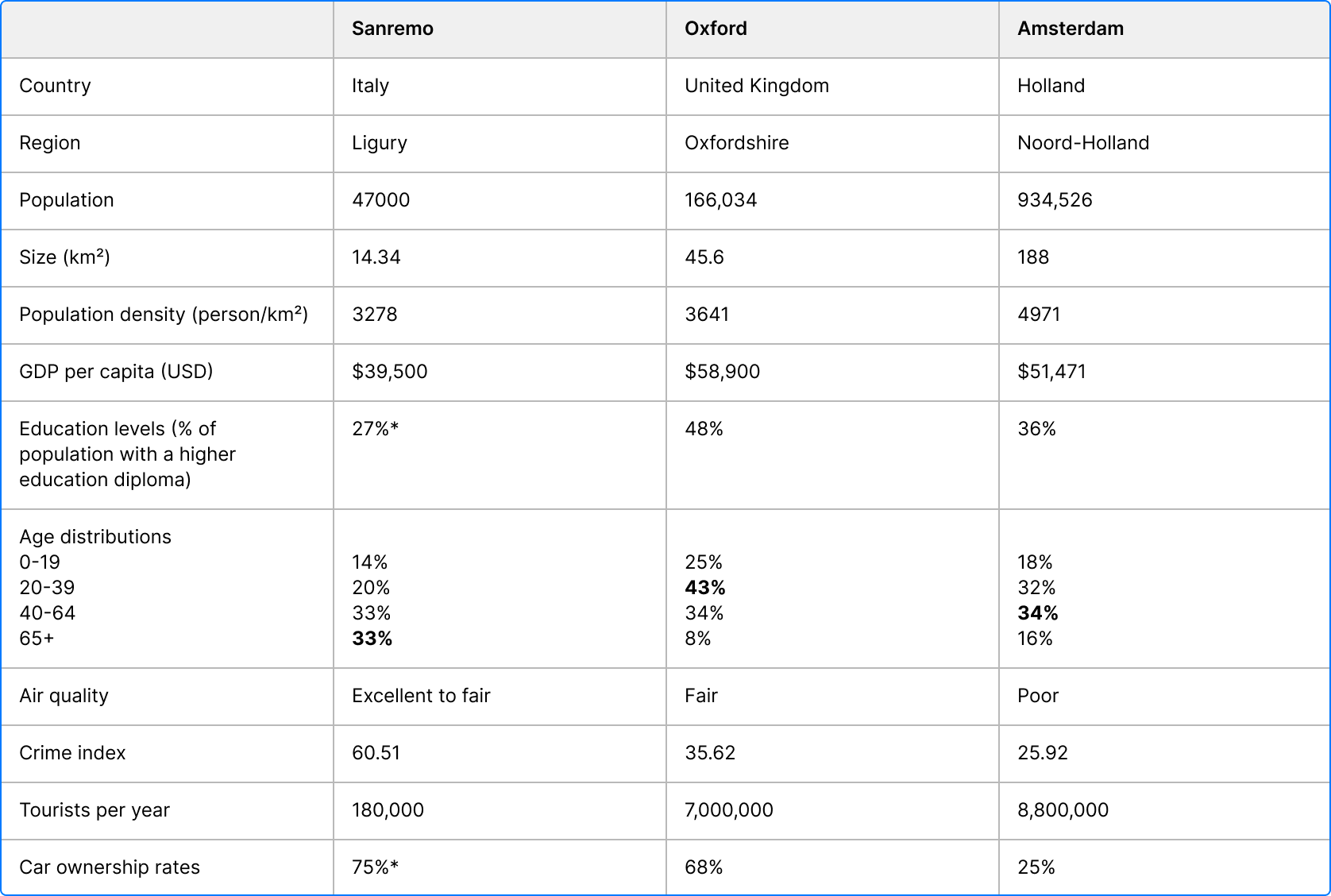
*data not found at the local level, Italian national statistics used in place.
Sanremo has the oldest population and the fewest number of tourists, with nearly 200,000 visiting yearly for the annual Sanremo challenge, a music festival. This same factor appears to skew the perceived crime rate. This 1-100 scale from Numbeo is based on self-reported perceptions and is thus sensitive to the number of contributions. Sanremo only had 23 recorded on the platform. I have never felt unsafe in this part of the world. [note that I write this as a young caucasian woman always travelling with in Italy with Italians]. I can also confirm that the air quality is indeed excellent there.
Oxford has a large student population, reflected in the age distribution as well as the education levels.
Finally, Amsterdam is the most populous and dense, receiving the most tourists per year and having the worst air quality. In Amsterdam, the poor air quality is intriguing, especially given the low car ownership rates; it is likely due to wind patterns and the heavy shipping industry. It could also indicate that car ownership rates might not be the best variable to capture vehicular traffic - in Amsterdam low car ownership rates make sense given the cycle culture and canals offering a third mobility option via boats, but doesn’t offer as clear an explanation for the air quality. Apart a few outliers, these statistics align with my subjective experience in each place.
Photos and a personal report on each city follow.
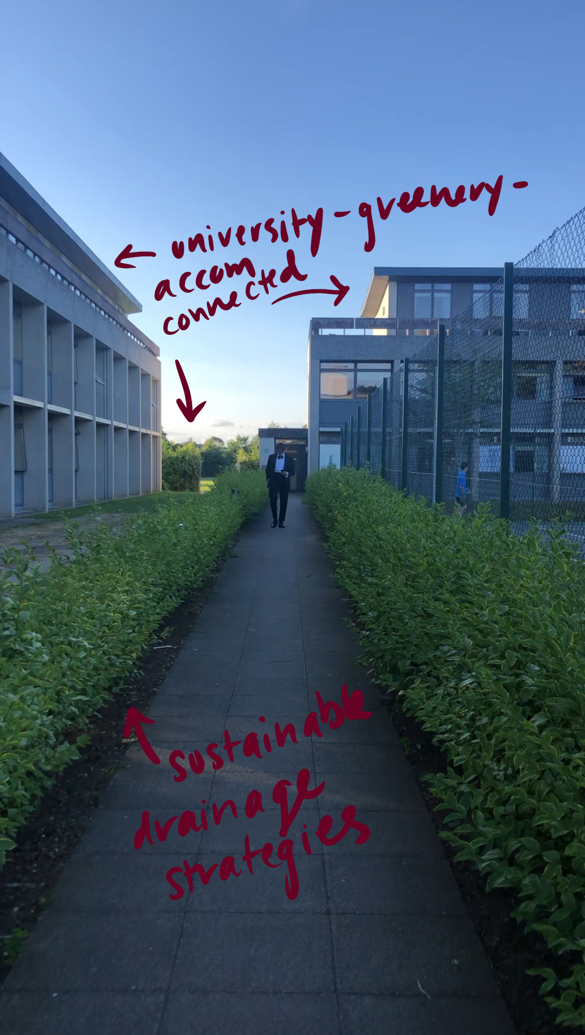
Sanremo
In all honesty this paper began as a love letter to Bussana, 7.1km east along the Ligurian coast from Sanremo proper. Bussana is paradise, population 74. Given its size and the similar structure of the towns along the coast of the greater Sanremo municipality (e.g., Arma di Taggia) I figured it would be appropriate to take Sanremo as the official city for the study. The culture, urban design, weather, air quality, crime rates, and climatatic variables I inspect are broadly the same in applying to Bussana as well. The photos below attempt to communicate the magic of this part of Italy, which coupled with the greenery, mixed use paths, light coloured materials with a high SRI (materials that reflect heat), and the use of traffic buffers, all make it a great place to walk.


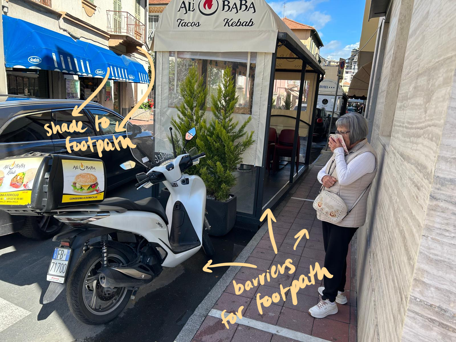

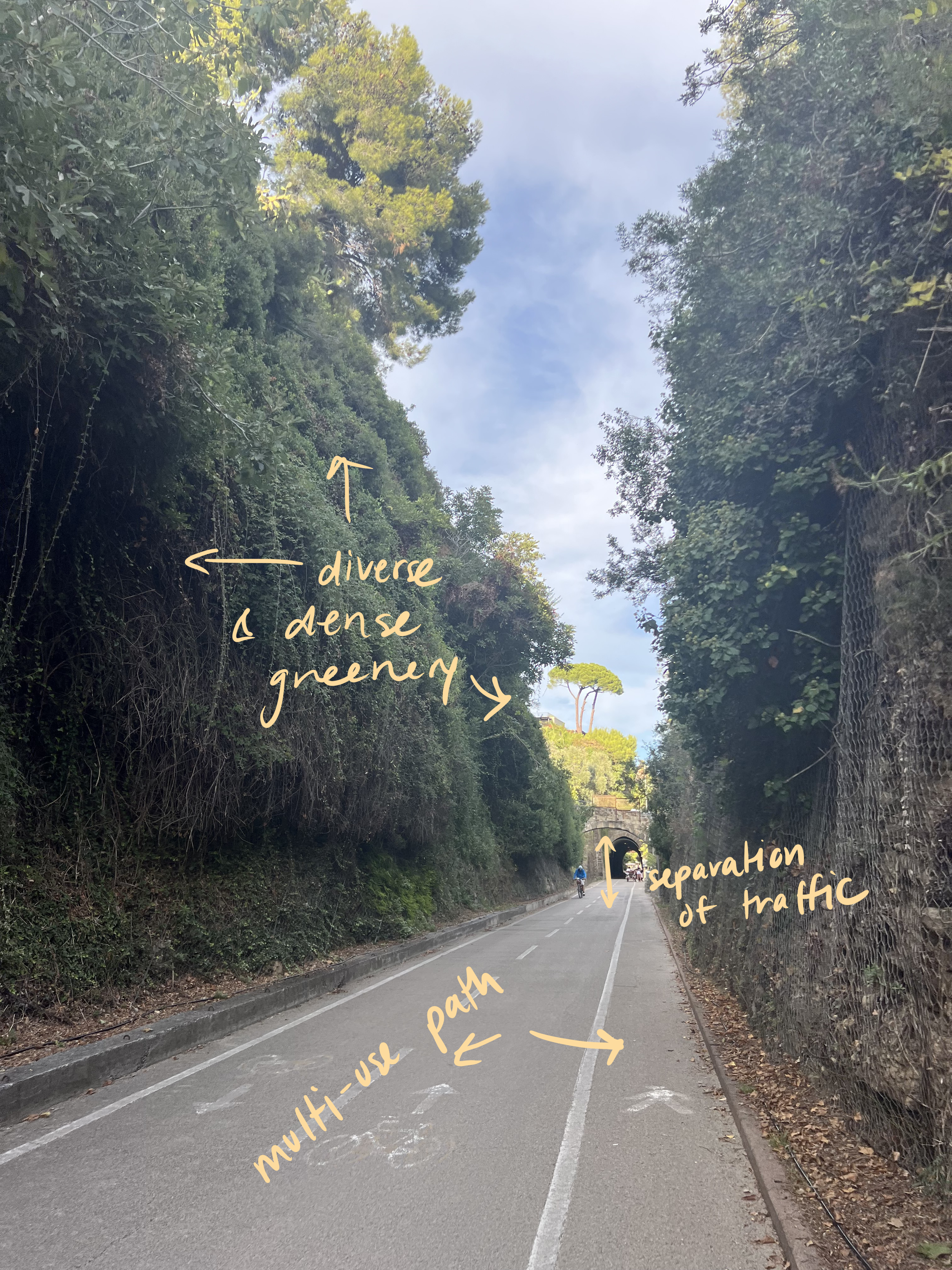
This combination of light urban surfaces, diverse and dense vegetation throughout neighbourhoods, and lower rise buildings which facilitate a cooling breeze to enter the town from the sea contribute to the thermal comfort in the streets of Sanremo. Multi-use footpaths run parallel with the coast enabling pedestrians and cyclists to exist separately from vehicular traffic, and pavements in the city-centre employ various intentional and unintentional buffer strategies to shield from cars, rendering narrower sidewalks safe.
Oxford
Given I have included London in other articles I thought it would be useful to spread some love outside the capital and pay homage to a university I made some great memories without having to gain acceptance. Although there are quite a few cars, busses, bikes, and electric scooters used to get around I feel it is a perfectly walkable place.
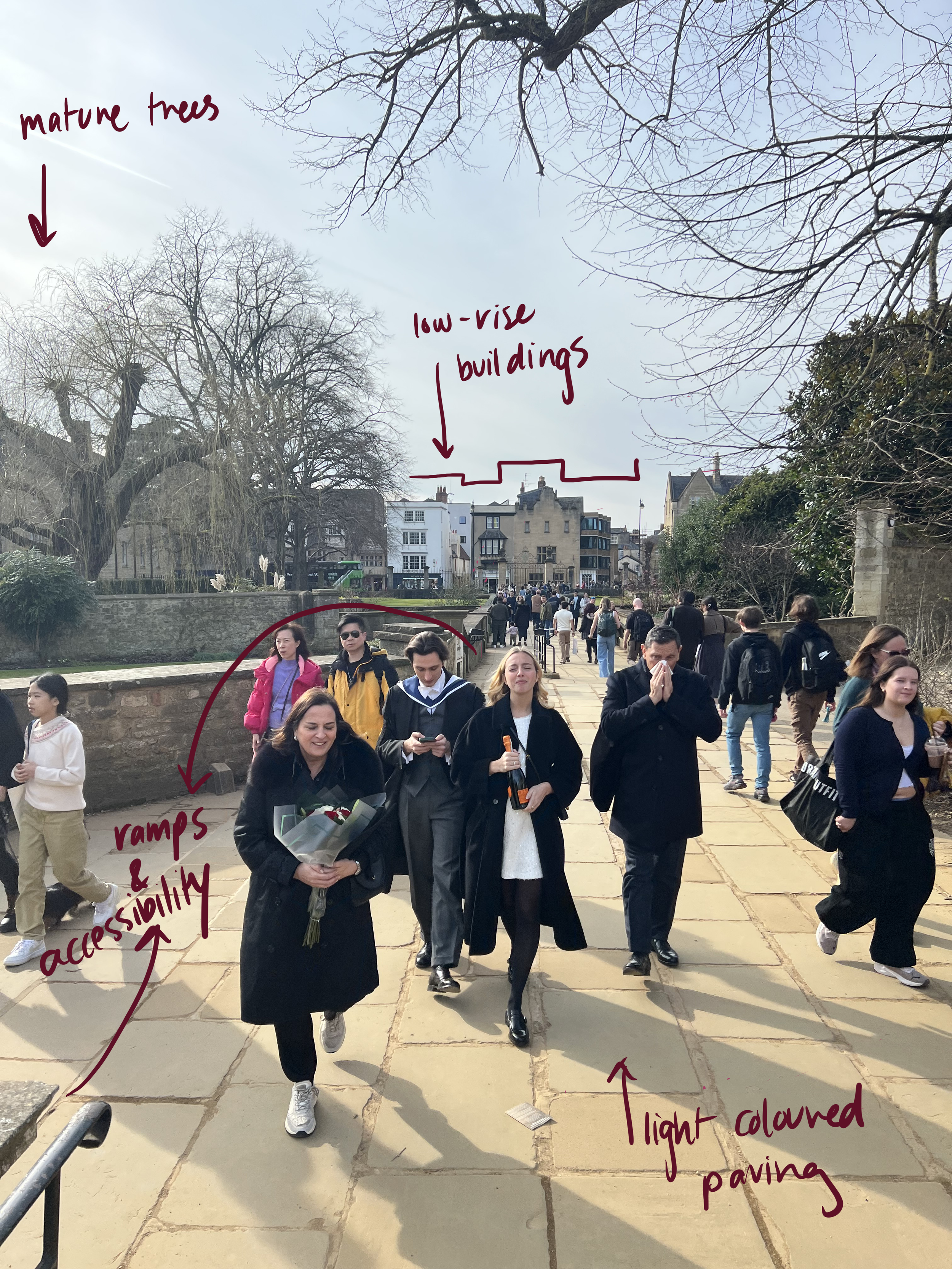

I am not always the most attentive and photos of Oxford’s city centre proper are missing from the above. However, throughout the colleges and residential streets pictured material selection, footpath width, and mature trees contribute to pleasant walking conditions. Many of the busy pedestrian areas have ramps and railings installed, enhancing accessibility. Similarly to Sanremo, buffers between pedestrians and traffic can even be as simple as parked cars.
Amsterdam
I have several close friends living in this Northern city and I, myself, have enjoyed walking the streets. I also chose to include Amsterdam because I couldn’t use Venice as the third city - Italy already being represented once and the car-less-ness of Venice being too unfair a skew - but I was curious to understand the impact of water bodies running through city-centres on the discussion.


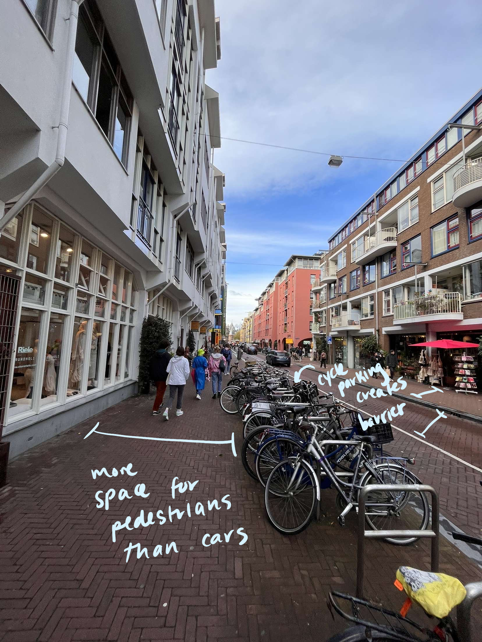
The photos make it clear that Amsterdam’s streets prioritise pedestrians, cyclists and public transport, and cars, in that order. Paths are separated and clearly demarcated. Walks take you along canals or through activated street fronts which further encourage engagement and slow movement on foot.
Existing walkability metrics
I summarise six existing walkability indices in the table below.
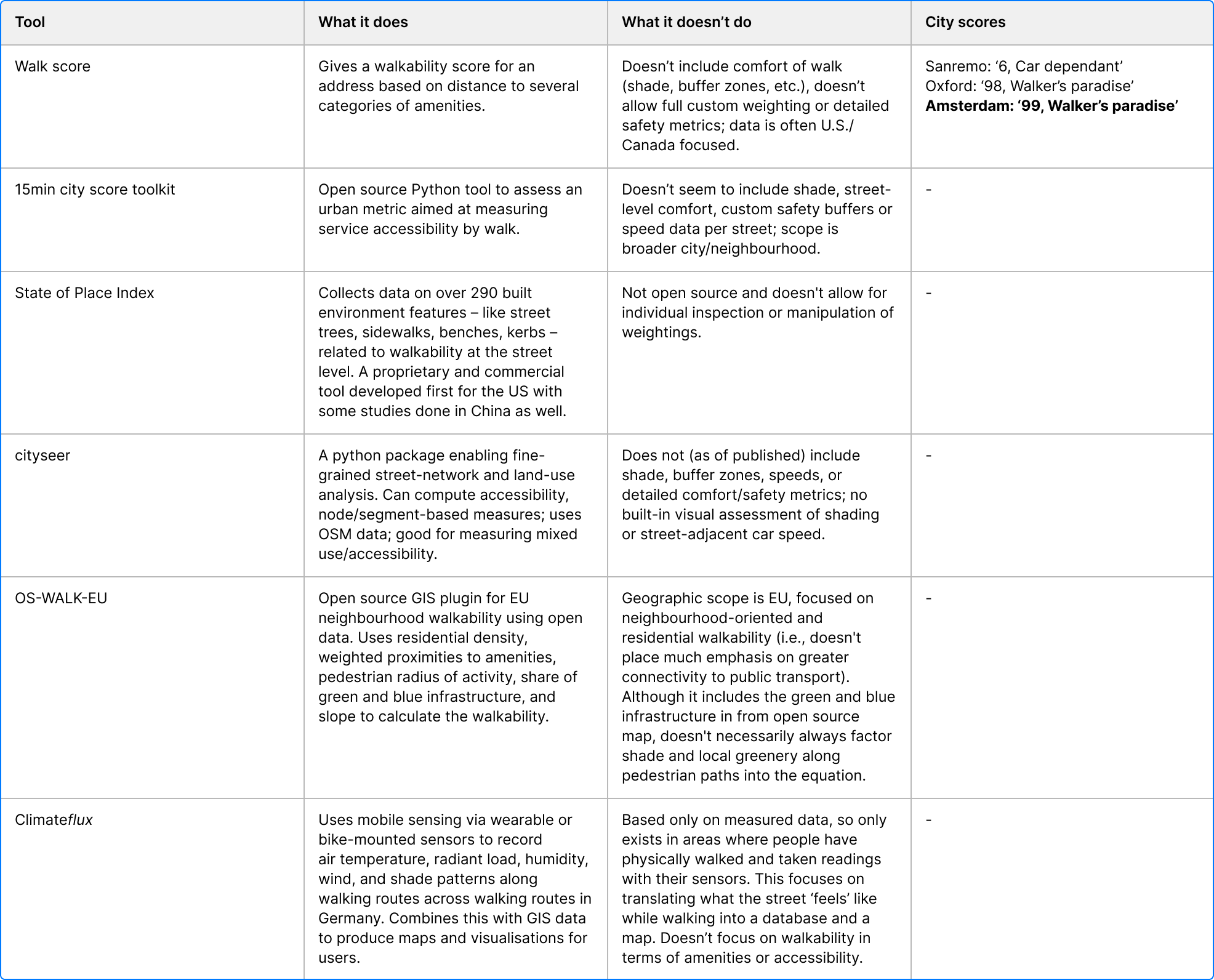
Table summarising six existing walkability tools
This tool is referenced by the WELL and Fitwel green building certification frameworks. It can be used to earn points towards a project by evidencing a well-connected site. It is a proprietary index and quantifies pedestrian-friendliness by assigning a score from 0 to 100 based on the ease of accomplishing daily errands without a car. The tool is very US-centric and it’s worth noting that is was created by real-estate developers, often used in conjunction with valuing properties and neighbourhoods for investment. Walk Score blends open geospatial data (roads, parks, transit stops) with proprietary commercial datasets used in the real estate industry and uses a distance-decay function so that amenities closer to an address contribute more to the score. Data licensing, formatting, language barriers, and commercial motivation mean that many countries are ‘unsupported’, or rather, not prioritised.
Given lack of data in general on Sanremo (and especially lack of data in English), it is likely that only major, internationally recognised ‘amenities’ are registered in Walk Score’s databases. This highlights the fact that in many cities around the world informal networks, tiny businesses, local bakeries, butchers, markets, and shops aren’t captured in these types of calculations. This results in an unrepresentative quantification of the city. Compounding this is the fact that these tools don’t consider culture or social norms in their scoring. For example, in Sanremo, it might be that the Carrefour, pharmacy, library, or local market is indeed a half an hour stroll from home, and on paper it’s more sensical to travel by car. However, in Sanremo that is exactly the point. Residents build a healthy lifestyle and routine out of walking each day to retrieve their necessities, all in good company and in good weather.
On the other hand, both Oxford and Amsterdam have much higher scores, considered a ‘Walker’s Paradise’. I don’t contest this, but I would simply add that weather and air quality aren’t taken into consideration. Oxford certainly prioritises convenience of amenities as a student-centric city, and Amsterdam is full of amenities as a tourist destination. I also concede that both are full of pedestrians year round, even in 0º C weather. This being said, I have ordered in more food and walked less in Amsterdam and Oxford than in Sanremo - be it due to the culture, the weather, or lack of leisure time. I know residents in Sanremo in anguish at the thought of Ubereats arriving to serve city residents. If that doesn’t reveal something about the culture and devotion to the walk, what could?
-
This tool is a python package that scores a given area by overlaying a hexagonal grid on a geometric file of the city (geojson file). It then generates walk-time isochrones (lines on a map that connect points reachable within the same amount of time from a single starting point) of up to 15 minutes from each hex centre using the local street network. It collects the amenity data from OpenStreetMap (OSM) across 8 predefined categories - Neighborhood services, Healthcare, Neighbourhood shops, Education, Sports, Cultural, Open Leisure, and Mobility - all tagged in OSM dictionaries and links each amenity to the nearest reachable hex. Finally, a distance-decay weight function is applied, in which closer amenities score higher, and the combined accessibility across all categories is normalised to a 0–100 index. I didn’t take the time to run this tool as I compute similar metrics later in the piece, however, the output would be a coloured map of hexes overlayed on the cities. If the shape file existed for Sanremo itself (data was only available on the wider Imperia region), the results would likely be more variable due to fragmented street grids; Oxford would have moderate walkability clustered around the centre; and the map of Amsterdam would be most consistently coloured given the dense mixed-use fabric and continuous pedestrian networks. This tool doesn’t consider green or blue infrastructure.
-
Cityseer is another Python toolkit for measuring accessibility of a city through street networks. It also calculates how many amenities people can reach within set walking distances, but builds on this to analyse how diverse the nearby land uses are and how central each street segment is within the wider urban fabric. Using OSM data it outputs reachability heatmaps, diversity scores, and movement centrality maps rather than one composite index as the Walk Score and above 15min city score toolkit. When applied to Sanremo, Oxford, and Amsterdam, it would likely show the wider Sanremo’s discontinuous network and hillside topography leading to uneven accessibility, Oxford’s moderate central walkability concentrated around the historic core and university grounds, and Amsterdam’s higher more evenly distributed connectivity and land-use diversity. This tool doesn’t consider green or blue infrastructure.
-
This is an open-source GIS tool (available as a QGIS plugin) developed for European cities to measure residential walkability. Its index considers residential density, weighted proximity to amenities, pedestrian radius of activity, the share of green and blue infrastructure in the neighbourhood, and the slope/terrain. This is the most comprehensive of the indices reviewed. In line with my earlier discussion, it looks more into the environmental conditions - excluding climate. Running residentials areas through the tool I would expect to see slightly more balanced scoring. For example, Sanremo might be more car-centric and disconnected than Amsterdam, but the blue and green elements associated with an Italian seaside town may help when inspecting smaller areas of the city, although at the same time the sloppiness may have a negative influence. In Oxford, the expanse of greenery and the interconnected university grounds may skew the residential density and allow for longer walking radii. Given Amsterdam’s even land-use distributions I would expect its score to be the most consistent with other tools.
-
My colleague, Stavan, shared this initiative with me given our shared interested in outdoor thermal comfort and particularly the design of streets. Climateflux was founded with the mission of amassing ‘climatic knowledge from a human-centered perspective’ and Climatewalks is their specific product focused on data collection to map the human-experience of streets. Quite literally an on-the-ground initiative, this engages citizens and volunteers throughout cities (so far only in Germany) to take to the streets with sensors and build a database that is much more accurate to the pedestrian experience than local weather stations which miss the impact of buildings and the urban environment on wind, shade, radiant temperatures, etc at human height. Their model encourages human involvement to promote equity, policy changes, and influence the design of cities.
I haven’t yet had the chance to join Climatewalks or gather any data in Sanremo, Oxford, or Amsterdam, however, we could expect different findings. In Sanremo, on the ground measurements could accurately quantify the cooling from sea breezes and refine analysis of where vegetation is effective and where streets, perhaps only lined with palm trees (more aesthetic than useful in terms of cooling), aren’t as comfortable. In Oxford it would be particularly interesting to see where - depending on the season and the time of day - it is most comfortable to walk based on sun and wind. For example, comparing off-piste routes through college lawns with the city centre streets. For Amsterdam the bicycle routes would be interesting to study, as well as the cooling impact from canals. Across the board, these measurements would be invaluable for understanding exactly what is experienced at the human level in streets at different times of day and in different seasons; this approach considers the climatic variables, urban fabric, and the subjective human experience all at once.
Methodology
After a conceptual discussion of walking, providing images and descriptions of each city, and reviewing existing tools, I outline next steps:
1. Present climate data on each city - temperatures, UTCI, rainfall, humidity, sun path and windrose diagrams characterise each climate. This will enable us to further compare the cities and contextualise a baseline experience for pedestrians.
2. Inspect blue and green infrastructure - vegetation density, water index, and satellite imagery to comment on location of water bodies all help to support the comfort narrative.
3. Present built environment data on each city - average building height, built density, and typical typologies including the building materials commonly used in of each city, as well as intersection density, speed limits, and details on the public transport and cycling infrastructure.
4. Inspect footpath friendliness - use OSM tags to look at kerbs, street furniture, and any other features along the streets that contribute to a pleasant pedestrian experience.
5. Inspect amenities - again using OSM tags, inspect different amenities available across the city (schools, restaurants, hospitals, cultural sites, retail/shopping, markets, libraries).
6. City-wide commentary - given all the data points above, in addition to descriptions from lived experience, each city can be generally characterised.
7. Select sample street sections - select a specific block in each city, given that I have walked there myself and have spoken with others who have walked there. Comment on comfort and walkability in the warmest and coldest periods of the year.
8. Comparison and discussion - in comparison with the Walk Scores generated in earlier sections for each city and the approach of existing tools, provide commentary on walkability and discuss implications of outdoor thermal comfort.
Climate data
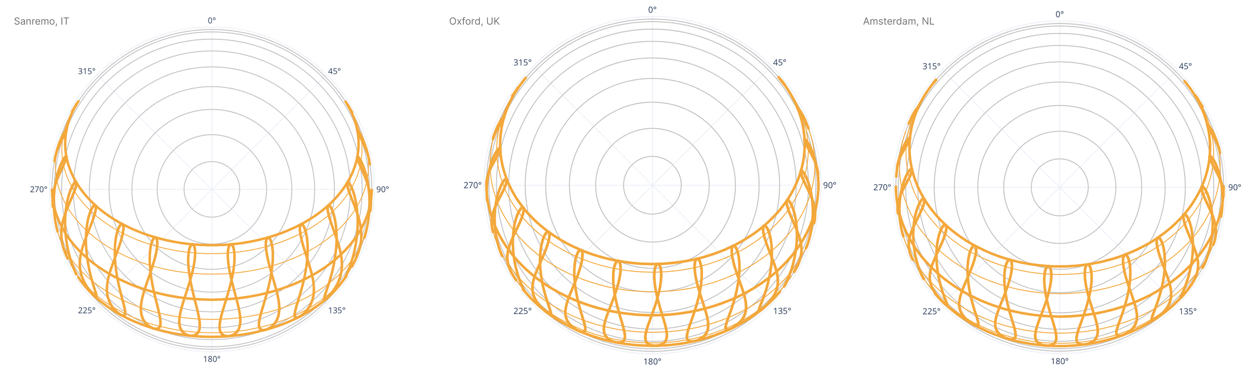
Being Western European countries, the annual sunpaths for each city are fairly similar. Sanremo benefits from warmer Mediterranean climate with slightly higher sun angle throughout the year. Due to their positions, Oxford and Amsterdam see longer summer and shorter winter days.
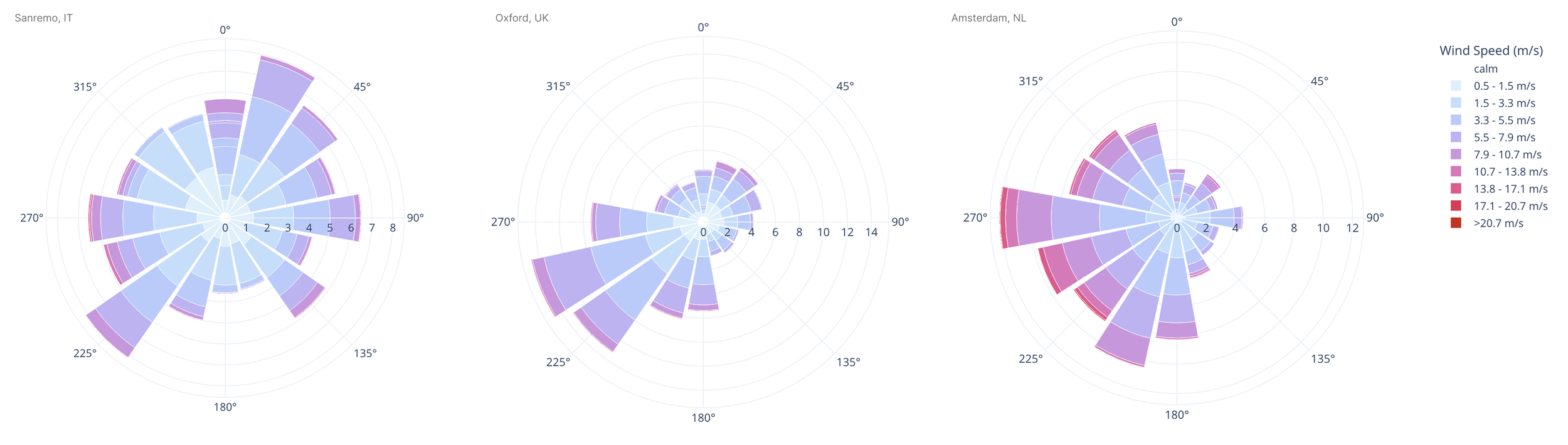
The annual wind roses show that Sanremo receives diverse breezes throughout the year, south winds coming inland from the sea but also coming over the mountainous geography from the north and east. Oxford and Amsterdam’s winds both come predominantly from southwest (their respective coasts).
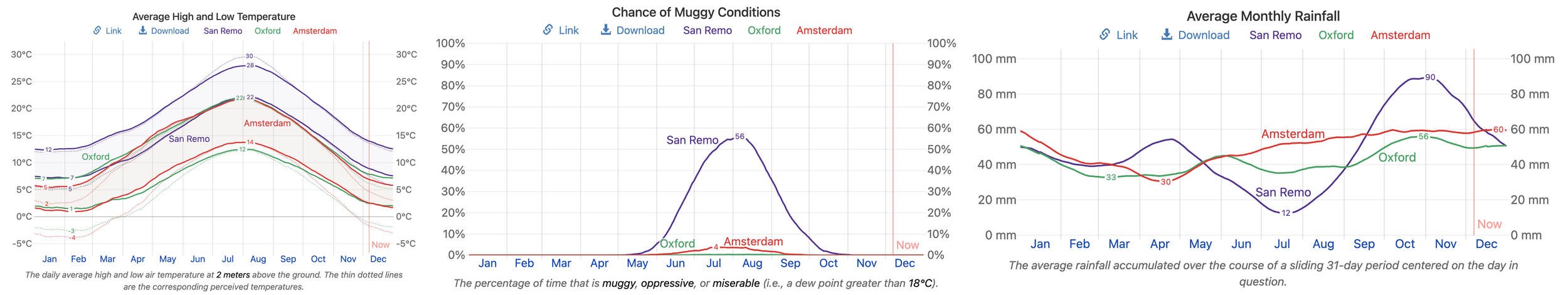
Oxford and Amsterdam experience average highs around 22°C, while winters reach average lows of -3°C and -4°C. Sanremo’s warmer climate averages a high of 30°C in the summer period and drops to average lows of 7°C in the winter. Sanremo is definitely the most humid of the three cities (discomfort mitigated by sea breeze) and also sees more seasonality with its rainfall concentrated in winter months as opposed to Oxford and Amsterdam where average monthly rainfall is more consistent.
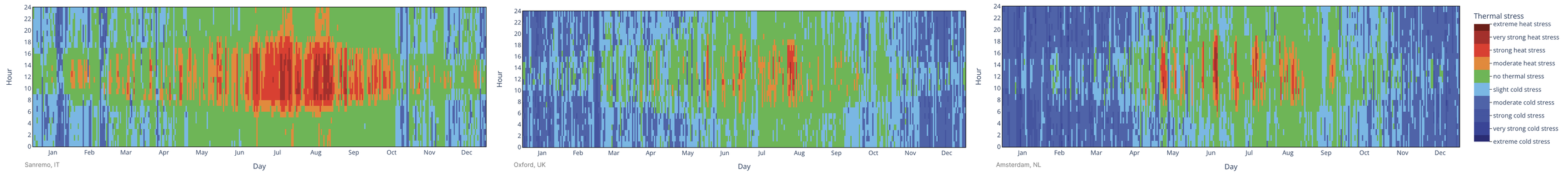
These UTCI charts show that Sanremo experiences the most heat stress in the summer months, with only few weeks of each year in Oxford and Amsterdam getting hot enough to be uncomfortable. On the other hand, most of the winter months in those two cities result in moderate to very strong cold stress. Sanremo’s UTCI suggests no thermal stress for a good proportion of daytime hours throughout the year.
Google earth engine and OSM
In the next sections I moved from CBE climate tool and Weatherspark which are great tools for characterising the general climate in the area to datasets in google earth engine and OSM, inspecting a specific 3km² bounding box around each city [Note Sanremo’s bounding box has been manually adjusted to stretch horizontally along the coast, capturing more habitable area due to the the sea. This increases the area considered in the analysis which has an impact on scoring using density metrics as well]. These are visualised in red below. In each instance, data was accessed from the most recent and complete annual set available.
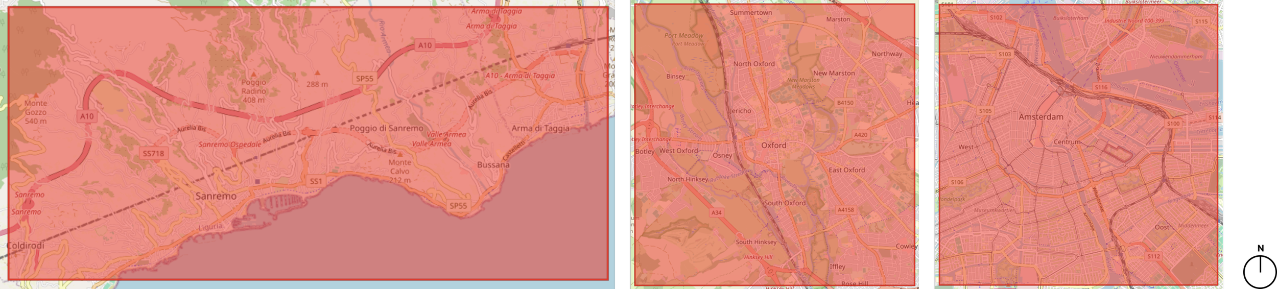
Bounding box of analysis for each city (from left to right: Sanremo, Oxford, Amsterdam)
Green infrastructure
To quantify the vegetation on a macroscale I used the Normalised Difference Vegetation Index (NDVI) to represent the density as well as the health of canopies by leveraging the contrast between near-infrared (NIR) and red light reflected by surfaces. A high NDVI value signals dense, healthier vegetation while lower values represent bare soil or built surfaces. Negative values show water, clouds, or snow/ice.
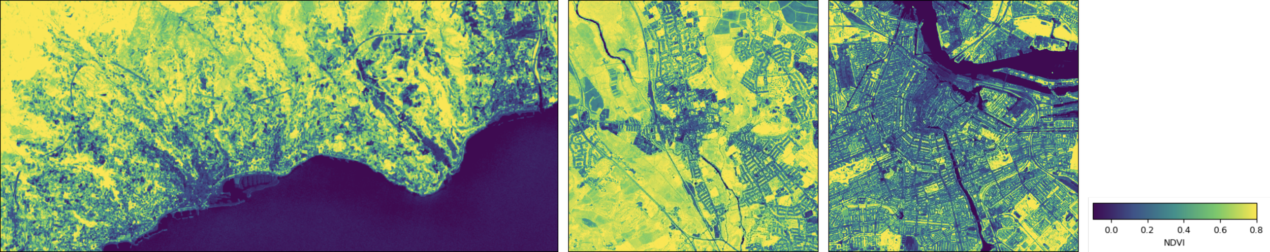
NDVI values representing location of vegetation (from left to right: Sanremo, Oxford, Amsterdam)
Sanremo’s mountainous vegetation north of the coastal towns are apparent. Oxford has the highest NDVI values around the city centre, given the sprawling lawns, mature trees, and extensive planting throughout its colleges. Amsterdam is clearly the least green of the three, its NDVI patches are concentrated in parks throughout the city.
Blue infrastructure
For water bodies I used Modified Normalized Difference Water Index (MNDWI). The NDWI metric was modified to enhance open water detection, especially in built-up areas, by suppressing noise from vegetation and impervious surfaces. Positive values indicate coast, rivers, canals, etc while negative values indicate built surfaces, soil, or vegetation.
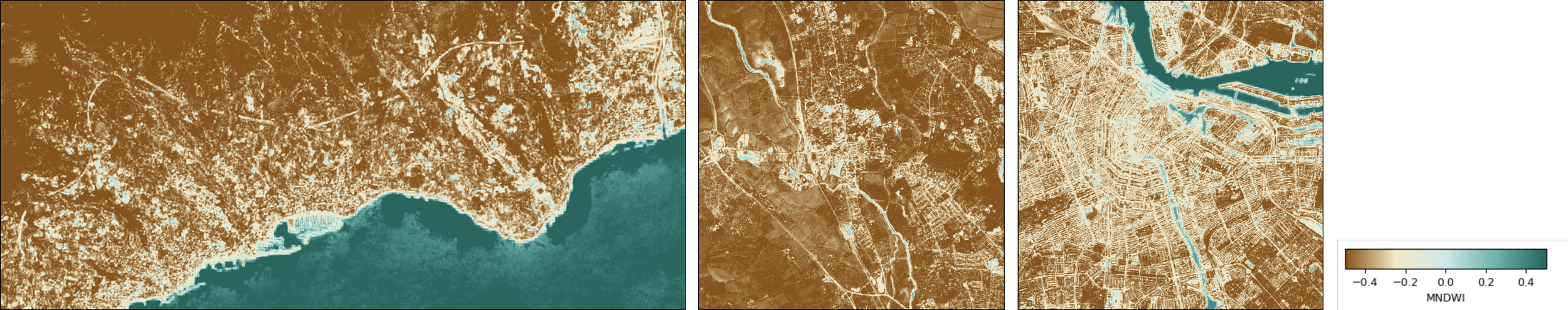
MNDWI values representing location of water bodies (from left to right: Sanremo, Oxford, Amsterdam)
Sanremo is a coastal town, so clearly the sea is the dominate water body. There aren’t prominent rivers, canals, or lakes elsewhere in the bounding box. Oxford has a low MNDWI throughout, and Amsterdam’s canals are clearly defined.
The table below summarises NDVI, MNDWI, and the % of surface-area in the analysis that is covered by detectable greenery or blue. This dataset only counts blue and green infrastructure detectable at 10m resolution. Narrow features may be under-represented and are supplemented with street level data from OSM in the following sections.
| City | Avg NDVI | Vegetation cover (%) | Avg MNDWI | Water cover (%) |
|---|---|---|---|---|
| Sanremo | 0.389 | 60.38 | -0.204 | 25.26 |
| Oxford | 0.579 | 87.30 | -0.434 | 0.66 |
| Amsterdam | 0.308 | 46.66 | -0.207 | 9.26 |
Urban fabric
The image below visualises the built up surfaces of each city. Sanremo’s build ups are concentrated in the port and city centre - same along the coast. Oxford’s built surfaces are concentrated in the city centre, and Amsterdam also around its port and a few hot spots throughout the city. Comparisons of mean building height, total built up area within the bounding box of analysis, and built up density (ratio of total built surface area to total land area within the study) is summarised in the table below.
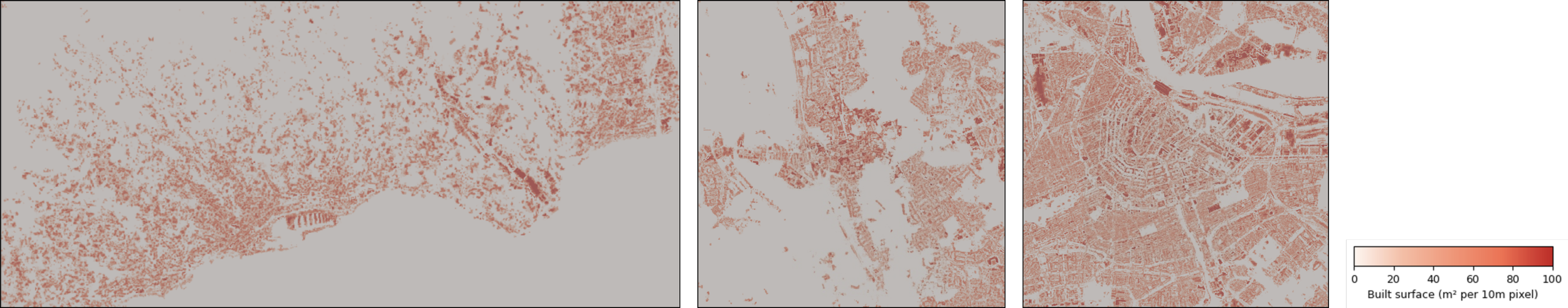
Built-up surface area in m² per 10m pixel (from left to right: Sanremo, Oxford, Amsterdam)
| City | Mean height (m) | Built area (km²) | Built density (%) |
|---|---|---|---|
| Sanremo | 5.32 | 5.95 | 10.81 |
| Oxford | 4.30 | 4.64 | 12.92 |
| Amsterdam | 11.98 | 10.03 | 27.90 |
Sanremo and Oxford are similar in building height, both average heights are less than half of Amsterdam. Sanremo has a higher total built area than Oxford, likely because the bounding box expands along the coast capturing roads and more sprawling towns whereas Oxford’s city centre is well inundated with parks, forests, and greenery (given the higher density but lower total). Amsterdam again has the most built area and the most density.
Beyond heights and densities in each city, to further communicate the pedestrian experience, it’s important to consider what the urban surfaces are made of (materials). The image below summarises building typologies in each city.
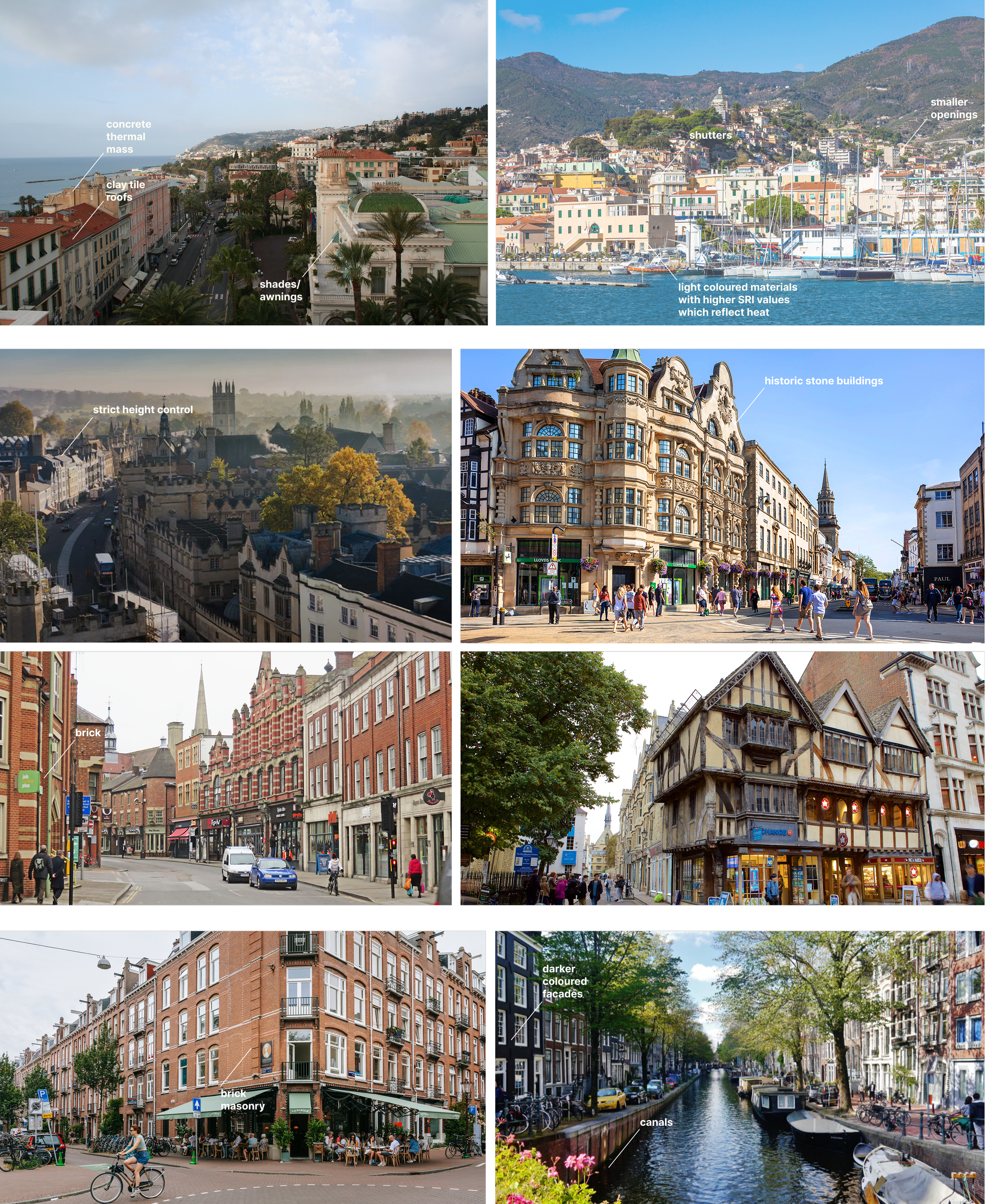
Inspecting the built environment of each city (from top down: Sanremo, Oxford, Amsterdam)
Sanremo’s built environment combines historic stone masonry throughout the hillsides with reinforced concrete apartment blocks along the coast, reflecting both its medieval origins and 20th-century development of the Mediterranean. The older fabric spread across the mountains is compact with strong thermal mass providing passive cooling, but has limited accessibility. The newer builds leverage clay roofing, rendered facades, materials with higher reflectance, and smaller openings with local shading measures to respond to the coastal environment while extending connection to the streets and the beach.
Oxford is dominated by low-rise stone and brick masonry construction, with medieval limestone collegiate buildings and later brick, shaping a compact but highly conservation-led fabric where height controls are strict and traditional materials are still heavily leaned on. Amsterdam is also characterised by low rise high-density masonry construction, with brick façades and timber foundations forming a continuous material lineage from 17th-century canal houses to the more contemporary blocks. In Oxford and Amsterdam the darker material palette would have a negative impact on thermal comfort in a warmer climate, but given the cold temperatures dominating most of the year, absorbing heat is to the cities’ advantage.
The next section shifts the focus away from the building fabric and onto the streets to proxy connectivity and the traffic environment using the following variables:
intersection density (intersection/km²)
average speed limits (km/h)
public transport (PT) point density (stops/km²)
cycling network density (km of network/km²)
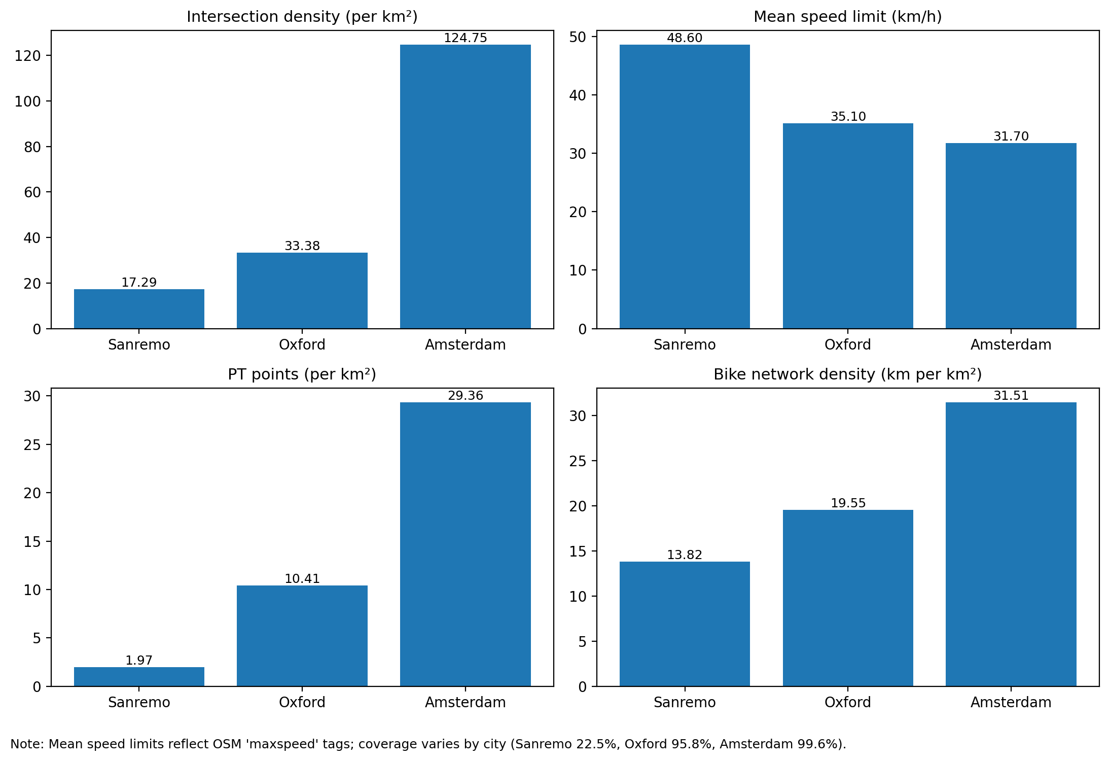
Bar charts representing the results across four OSM variables related to traffic and connectivity
Beyond having a larger total study area, Sanremo’s coastal topography and arterial roads reduce permeability which results in lower intersection density. Oxford’s historic centre is compact but conservation constraints and larger blocks reduce the density compared to Amsterdam which has a fine-grained network. The data on mean speed limits is useful, although it should be noted coverage varies by city and Sanremo has the lowest. Likely only the main streets (with higher speed limits) are captured in the analysis. Inspecting public transport points, Sanremo shows limited stops, reflecting car-oriented (or pedestrian!) mobility. Oxford’s score increases, reflecting the bus-density with limited rail penetration. Amsterdam has the highest density of public transport stops reflecting the spacing of its multimodal network (tram, metro, bus). Finally, the cycle scores reflect that Sanremo has a strong but corridor based network while Oxford’s paths exist, but are fragmented. Unsurprisingly, Amsterdam’s globally exceptional cycle network puts both of the two to shame.
I accessed further ‘pedestrian micro-features’ using OSM point and area tags, expressed as feature densities/km² or, in the case of green space, as a percentage of the total study area:
Lowered kerb density - locations where pavements are level with the street, enabling step-free crossing
Street furniture density - tags include
amenity=bench,amenity=waste_basket,amenity=drinking_water,amenity=shelterTree density - Individually mapped street and park trees, potentially capturing street level shading that was too granular for the NDVI 10m resolution to pick up
Green area (%) - Total area of green polygons detected at street and block level through
leisure=park,landuse=grass,natural=woodtagsTraffic calming density - physical or regulatory measures that reduce vehicle speed and improve pedestrian safety (e.g. speed humps)
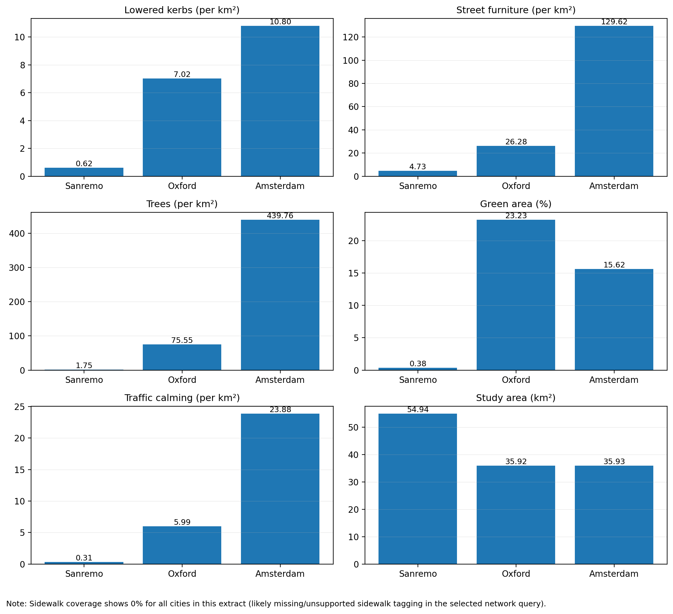
Pedestrian micro-features in each city compared using OSM tags
Consistent with commentary so far, we see that Sanremo scores the lowest across these metrics, especially when looking at densities. The study area is shown in the bottom right as a reminder of potential skews; I wanted the impact of the topography of Sanremo, and the sprawl of coastal cities along the Mediterranean in general, to be a part of the discussion in this paper which is why I chose not to modify the analysis geometry. By stretching the bounding box along the coast horizontally I could include more populated urban areas as opposed to more of the sea to the south or mountains to the north, or I could shrink the bounding box to include only Sanremo proper and the density of the single town, but I chose to leave it as is.
The results are mostly as expected, showing Amsterdam to be the most dense with micro-features. Two results worth discussing further are the trees/km² and green (%). Amsterdam municipalities and mappers thoroughly tag individual trees and the city’s density means that their greenery is vertical, this explains why the score for tree density is so much higher than Oxford, despite the fact that Oxford’s green (%) is higher. In Oxford, the parks and vast greenery not only results in more area of land use as continuous green, but the effect is likely compounded given that trees are tagged less rigorously. This divergence between tree density and green area coverage is documented in OSM tagging practices, but nevertheless important to discuss. Numbers in isolation can be misleading or leveraged to fit different narratives depending on the context.
Finally, I look at amenities (retail, restaurants, healthcare, etc) in each city, and how many are within a 15 min walk along a sidewalk.
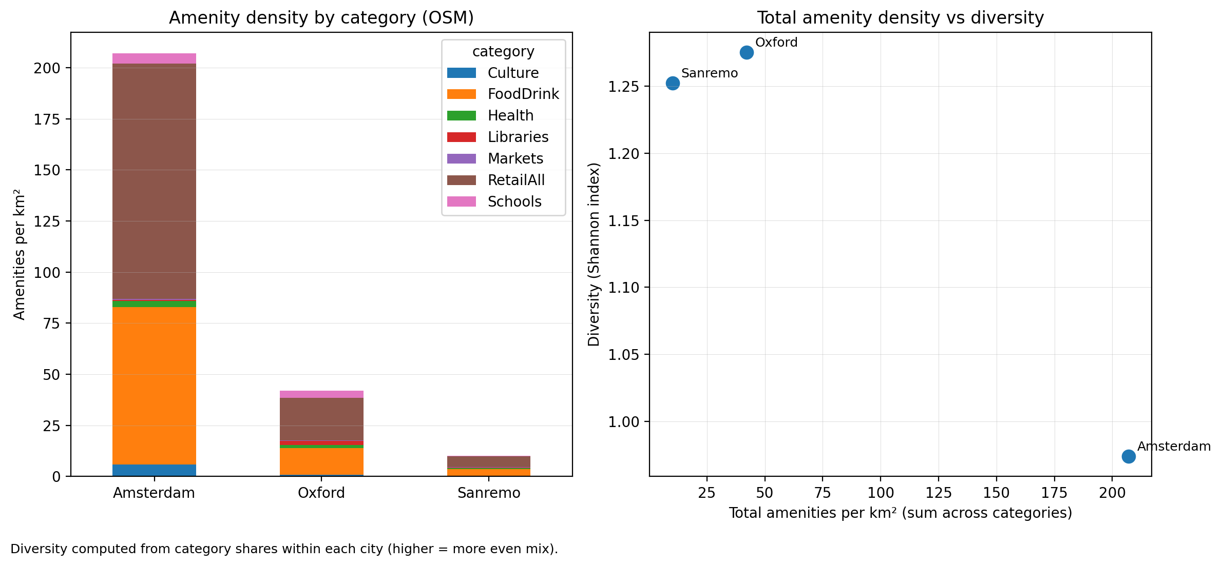
Amenity density and amenity diversity in each city
Amsterdam proves to be the most dense with amenities but more homogeneous, dominated by retail. The Shannon index is used to proxy diversity of amenities by looking at the total number of amenities but also the categories. These results align with the earlier characterisations of the cities. Amsterdam receives many tourists year round resulting in a bigger shopping scene, while Oxford and Sanremo balance student or residential populations with tourism and have a more diverse mix of land use. These results can only access amenities that have been tagged and likely overlook small, local, or new establishments.
So, at this point I have inspected the climates in each city, then using a smaller bounding box characterised Sanremo, Oxford, and Amsterdam based on several of the above metrics influencing walkability. Next I will look at a specific street section in each city to comment on the probable pedestrian experience in the warmest (July) and coldest (February) points of the year.
Street canyon comparison
I selected an EW oriented street in each city and inspected the section.
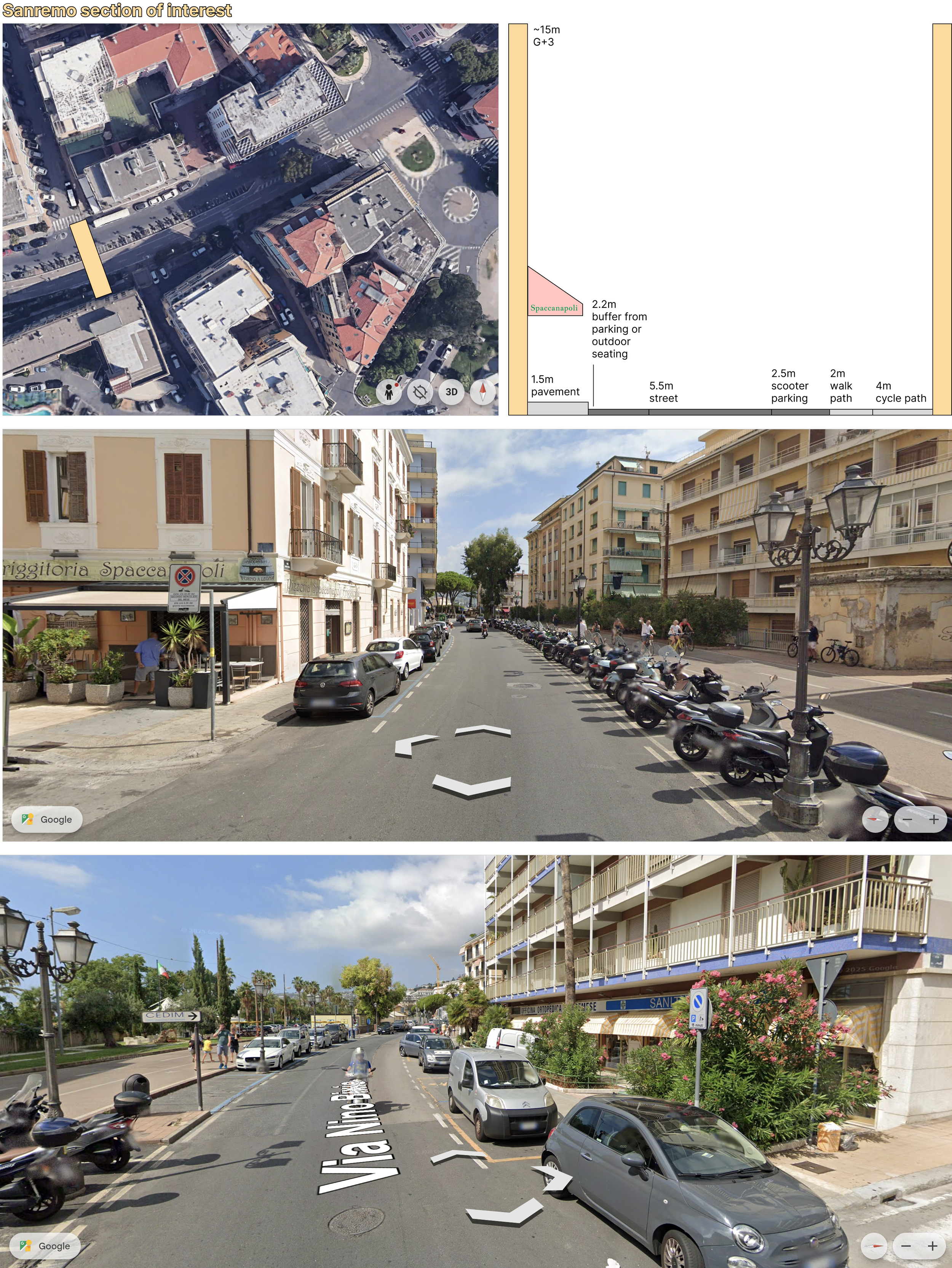
EW street section in Sanremo near a pizza place, Spaccanapoli
This street is near to the port and home to one of the best pizzas I have had thus far in life. I have calculated the aspect ratios (street canyon H/W) from facade to facade, including all pedestrian infrastructure at street level. Because of the multipurpose path and the generous allowances for parking of cars and scooters, the aspect ratio is 0.83; the width of the street is greater than the height of the buildings. The surfaces are light coloured to reflect heat and vertical and horizontal greenery can be seen along the section. In summer the predominant winds come from the south east, meaning they aren’t channeled down the street and are less effective at reducing heat stress, especially for streets further from coast and impeded by buildup. In the winter the winds shift and come mostly from the southwest. Similar logic applies, so any breezes that provide comfort in summer contribute to the cold stress in winter, and those blocked stay blocked.
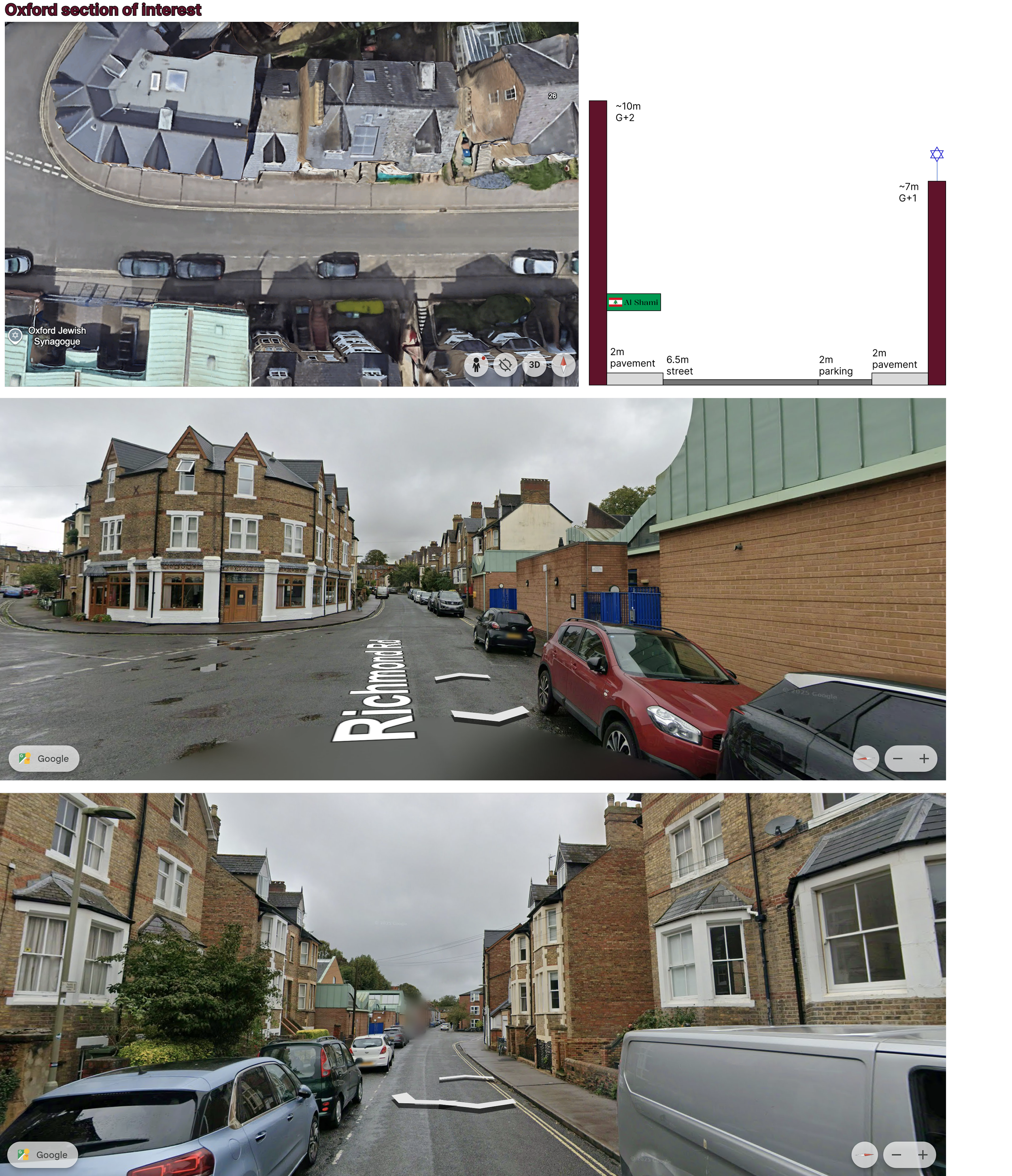
EW street section in Oxford home to a synagogue and a lebanese restaurant
I find this section poetic. A delicious Lebanese place, Al Shami, faces the Oxford Jewish synagogue. What better street to inspect for comfort and discussion on navigability? Here the aspect ratio is similar to Sanremo, around 0.8. There is less greenery and narrower pavements with a buffer provided from parked cars along the south side of the street. Despite the restaurants and the particular land-use mix captured in this section, the dominating typology is residential. The materials are less reflective than those in Sanremo, with more brick and darker asphalt. In Oxford the wind direction doesn’t change throughout the year, both summer and winter winds come from the southwest, just at a higher velocity in February compared with August (months with lowest and highest temperatures respectively). Similarly to Sanremo, winds won’t be channeled directly down this particular street. It should be noted that the least comfortable orientation in Oxford would likely be north south given the wind direction.
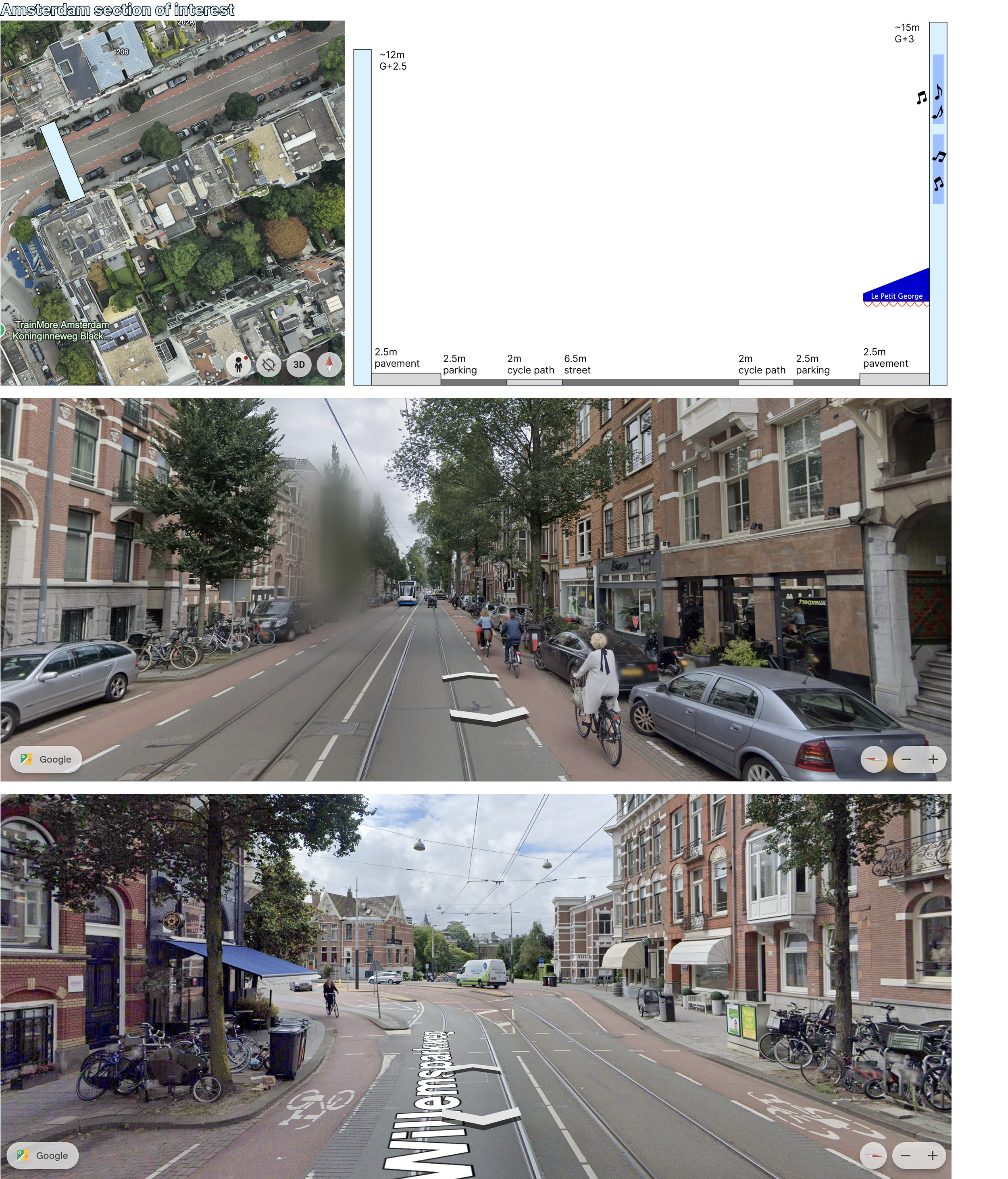
EW street section in Amsterdam
This street in Amsterdam shows the extent of infrastructure for cyclists and pedestrians. Located near Vondelpark, this is another section with different uses: flats are stacked on top of ground floor retail and restaurant spaces. The materiality is a lot of brick and darker palettes than Sanremo, similar to Oxford. Wind patterns differentiate Amsterdam from the other two cities; in both the hottest and the coldest days of the year, the winds come from the east. This will help with street level ventilation and ideally flush away pollutants (although we have seen in previous sections that some of the wind arriving from the sea and busier ports may carry pollutants with it, contributing to Amsterdam’s lower air quality). In the summer months it should create a cooling effect, however in winter months it will increase cold stress.
How many variables did I consider?
I have discussed these cities from climate, social, economic, [mildly political], architectural and urban design angles amassing data points from 30 variables. These data are more or less representative for each city; many factors can skew and bias them. However, it is quite an exhaustive list and certainly conceptually captures the different facets of walkability.
Variables found more ‘favourable’ to walkability highlighted across thirty different datapoints for each city
For each variable I highlighted where, either personally or based on research and general consensus, the city is ‘ahead’ or provides the most favourable walking conditions. These thirty data points can be mapped to the ‘conceptual’ areas discussed at the beginning of the piece, as well as any ‘categories’, ‘strategies’, or ‘pillars’ of good design.
This is the approach that a lot of benchmarking systems, frameworks, rating matrices, and indices work in my industry. For example, the variables used to proxy the climate and green and blue infrastructure would be weighted and assigned to a category to represent the outdoor experience of the pedestrian. All of the variables which represent amenities available to pedestrians - how many, how diverse they are, and how they are distributed - would be weighted and assigned to their own category to represent the things available for the pedestrians to do, and to show that they can access necessities as well as places that bring them pleasure. In combination with the amenities then you must look at all the variables that represent transportation - cycling, buses, trains, cars, and of course walking! - to ensure that the amenities you provide can be easily accessed by the people. You can quickly see how this category is related to the design of streets and there you must consider footpaths, speed limits, buffers, and all the variables discussed in this piece which represent, you guessed it, the pedestrian experience. Keep in mind that we were looking at all these variables from the human perspective, and we haven’t even discussed the environmental approaches and sustainability that must be considered in parallel [thankfully the way the world works, usually the things that are good for people are good for the planet. They just don’t happen because they aren’t good for the ‘check book’ or they aren’t ‘efficient’].
So, designing for people (and for the environment) is complex. It necessitates this separation of variables and siloing of strategies to simplify, quantify, and track progress. At the same it absolutely necessitates thinking about everything all at once and understanding the interconnectedness of those very same metrics. See the visual below.
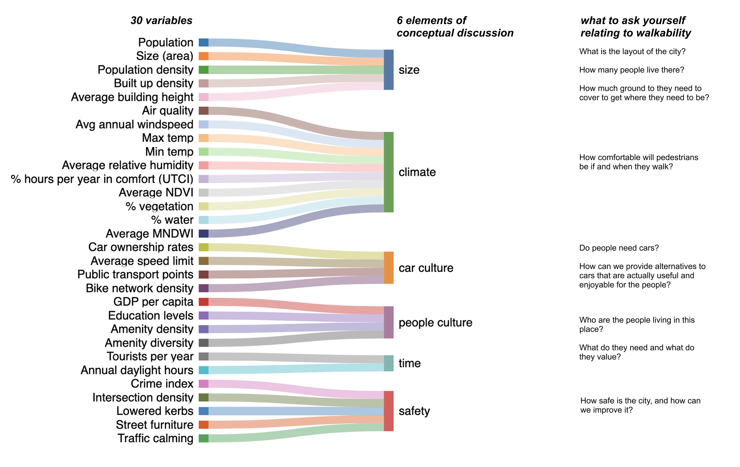
Mapping the thirty variables I collected data on with the six conceptual elements of discussion from the introduction to this piece, and of course, some questions on the sidelines to ask yourself relating to walkability
This piece is almost over, I promise. to conclude I must answer the question in my title. ‘How pleasant would it be, to take a walk here with thee?’ and I will do so structured using the graphic above, commenting also in comparison with the Walk Scores output for each city (Sanremo: 6 Car dependent, Oxford: 98 Walker’s paradise, Amsterdam: 99 Walker’s paradise) to finally try and address what I promised to address earlier on.
Size
Sanremo itself has the smallest population, size (not the same as the size of the bounding box used in GEE studies!), built up density, and average building height whereas Amsterdam has the largest for across those same variables. Oxford sits in the middle. In terms of walkability, this aligns with the human experience you would have in each city. Sanremo is relaxed, and you enjoy walking a bit further in a nicer environment. Amsterdam is a busy city with pockets of calm in their parks and along canals. You’re a tourist or working or studying in a city and you enjoy the fact that convenience encourages the walk. Oxford is historic and slightly more sprawling to accomodate a massive university ecosystem as well as the permanent residents. In my opinion, it’s the least walkable outside of the city centre but it’s still nice. In regards to size, I would say it’s a tie.
Climate
Sanremo is the winner here, unless you’re sun-avoidant, with the most hours of the year in comfort and the best air quality. The sea also means that it has the most blue infrastructure, although Amsterdam’s canals mean the water is integrated throughout city centres and not accessible only via a coast. I would challenge the NDVI, green (%), and other vegetation metrics used in the paper as my photographs in earlier sections show, and in my own experience I see beautiful and diverse greenery in Sanremo. Oxford and Amsterdam are cold a lot of the year, and I hate the cold, so as I reiterate throughout the piece, my answer is biased.
Car culture
Certainly Sanremo necessitates having a car more than the other cities, but it doesn’t mean that in Sanremo people don’t love to walk and do it often. This is the main point I make throughout - that without being there, understanding the vibe and considering the culture, you cannot take metrics and label a city ‘car dependent’. This being said I will give Amsterdam the win here as it certainly has a strong cycle identity (note you will be freezing on your bike most of the year…) and a great public transport network (so even when it’s freezing most of the year you can get from A to B effectively). For me, Oxford is average when it comes to car culture. The immense amount of students offset the permanent residents that have cars - some because they need them and some because they want them.
People culture
Oxford has the highest numbers across the variables in this category and I agree that due to the international demographics and the lifestyle of students in a city like this, they will walk a lot. It helps that there are quite diverse amenities available to the pedestrians. In Sanremo, the people culture also has a generational influence, and the older residents certainly walk for health, pleasure, and because they can. Tourists also walk because they come in the summer seasons when the weather and their schedule allows, or they drive between towns and walk within the town to explore and learn. In Amsterdam people are busier, and potentially more practical so they would likely cycle or take public transport before walking, however, there are also many tourists that only walk. I will concede this one to Oxford.
Time
Sanremo has the most average annual daylight hours and as mentioned above, the oldest population. This means they have more time to walk. As I also mentioned above, tourists come on holiday where the aim is to enjoy and take your time… Sanremo certainly wins this one. Oxford is a close second as students have time and use that time to walk between classes or meet friends and stroll. However, because it’s so uncomfortable there for a higher portion of the year, the climate works against the incentives to walk. Similarly in Amsterdam, as well as the same reasons mentioned in the people culture section, I would put this city as last place in the time category even when considering the volume of tourists.
Safety
Last but certainly not least is safety. On paper Amsterdam wins this - their density metrics are much higher than Sanremo or Oxford, and their crime rates are lower. However, as I mentioned earlier in this piece, the crime index relies on visitors to self report, so is very sensitive to the total number of reports. Sanremo had very few, whereas the number of people and visitors means that Oxford and Amsterdam have more reviews. I feel safe in all the cities, however, I would put Amsterdam and Sanremo ahead of Oxford. This dimension is dependent on who you are, when you visit, and the choices you make, so I feel I cannot make a generalisable conclusion. Walking at night I would feel the most safe in Amsterdam so I will give it the win.
I was hoping exactly this would happen, that there would be no clear ‘winner’, and the discussion would continue to demonstrate that there is no foolproof way of capturing every variable and accurately quantifying the walkability of a place. Giving a beautiful Mediterranean city a score of ‘6’ is misleading, just as calling a place that is only in comfort 31% of the year may be a bit generous. Walkability is too dependent on us as people, and therefore how we shape our environment. Don’t misunderstand, that is no excuse for bad design. We should continue to push to make our cities greener, bluer, integrate more parks, community spaces, street furniture, to continue pushing cars and traffic out of sight/smell/hearing distance where it makes sense and it’s possible, and at the same time we do that we must improve cycle routes and public transport to keep everyone and everything connected and accessible. My only point is do nothing blindly or in isolation, or for the sake of chasing a score. Do it with intention and only after you’re informed by the people and the culture that do live or will live there.
Further work and limitations
The point of this piece was not to propose a novel metric or rating system, but as always, to make people smile and think. Further work could take many directions - more detailed analysis using 3D models which can better communicate the pedestrian experience in terms of views and thermal comfort. Further modelling would provide a better representation of the conditions actually felt at the pedestrian level (wind speeds from a calibrated CFD versus the wind roses shown earlier which are measured at a 10m height, or by quantifying the radiant temperatures from built environment surfaces, etc).
It would also be lovely to collect on the ground data - both measurements and further conversations with people who walk, following up on the Climateflux initiative and slowly working to create a complete database that can supplement GEE and OSM information. The further work I plan to do in reality is visit more cities and think continue to think fondly and critically about their design. This is what I encourage you to do as well!